
The project was created for a startup based in Los Angeles that connects Fortnite Creative and Roblox creators with brands.
I was responsible for the light version of the design system, redesign dark version, designing screens that the product did not have yet, and for redesigning screens that had been built without a designer, which is why the same element could look and behave differently from one screen to another.
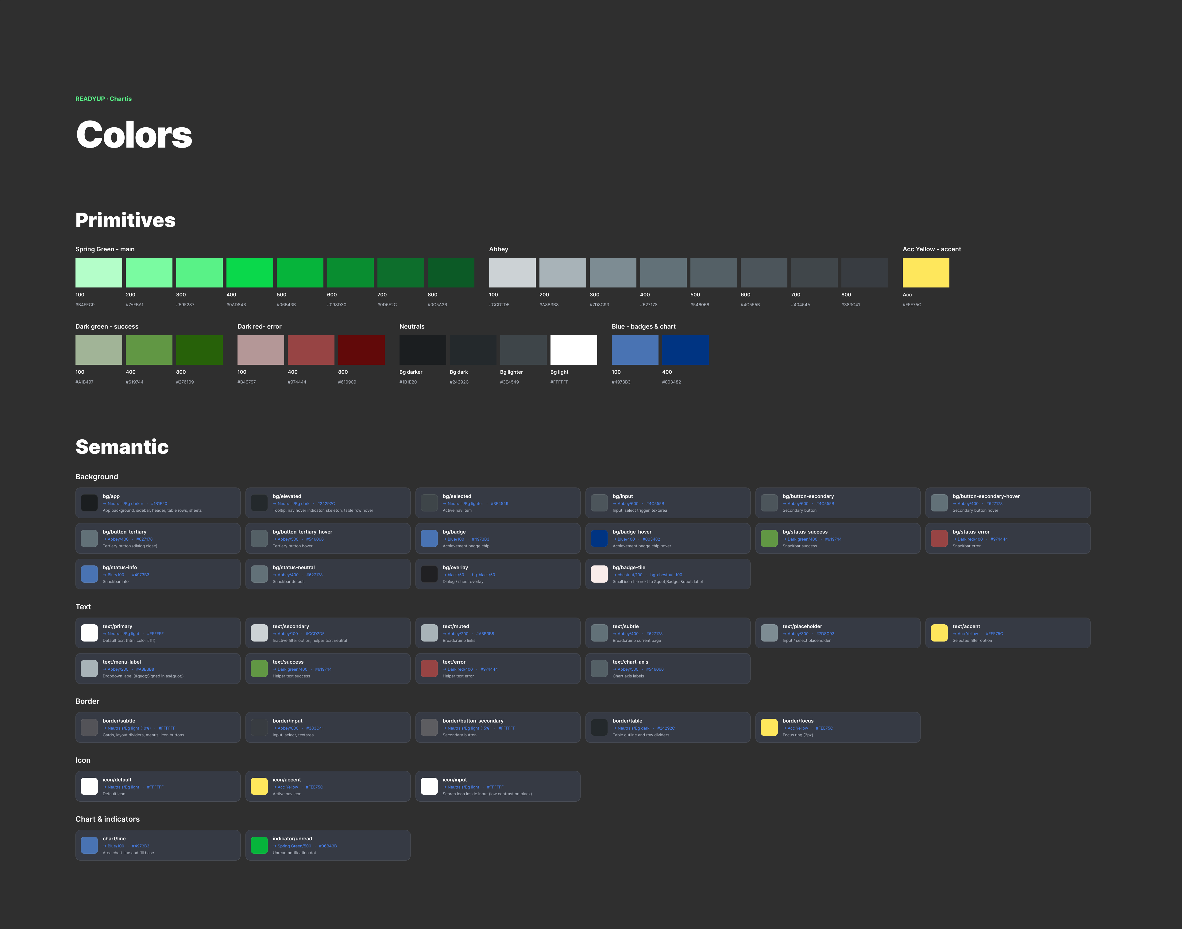
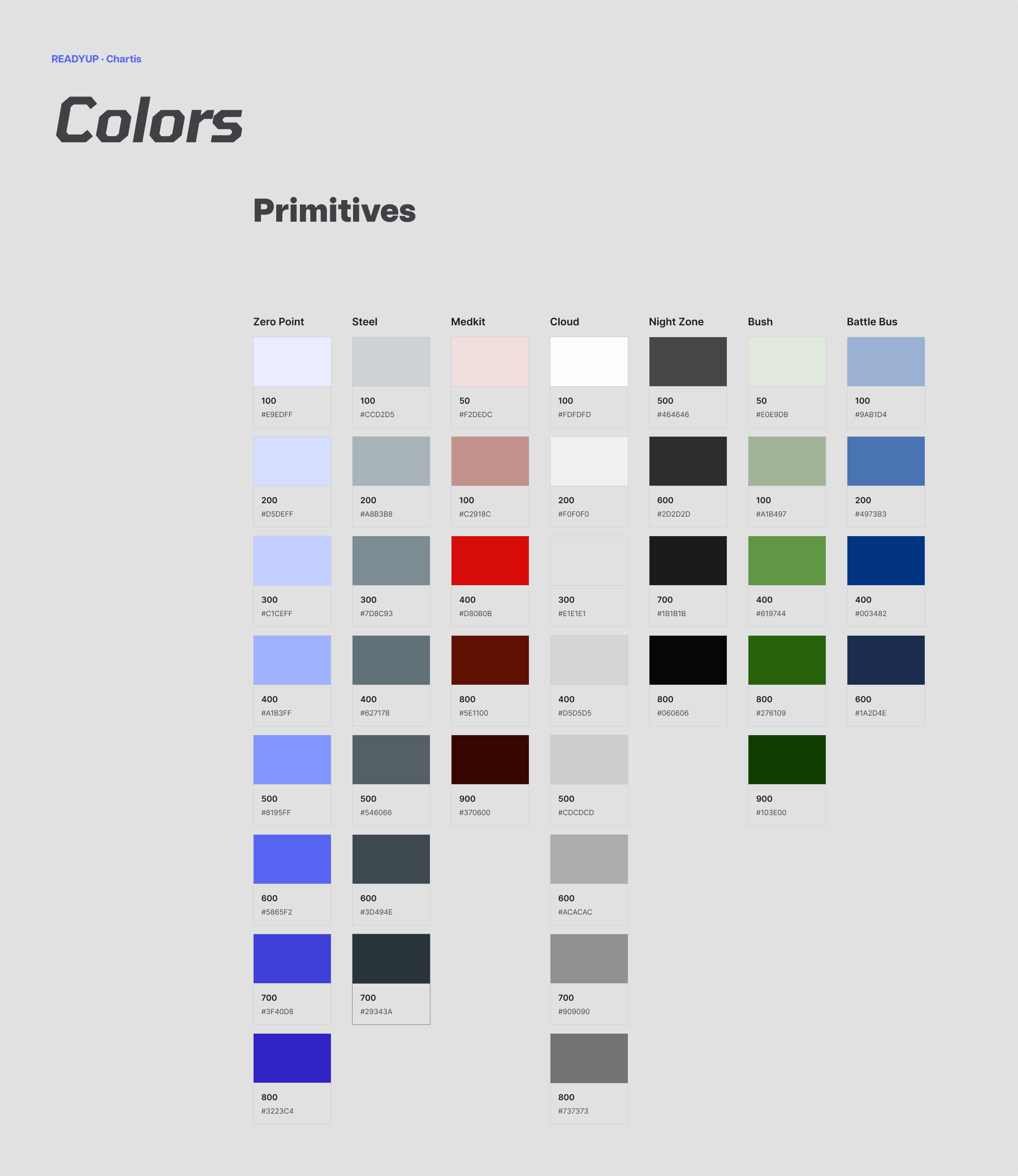
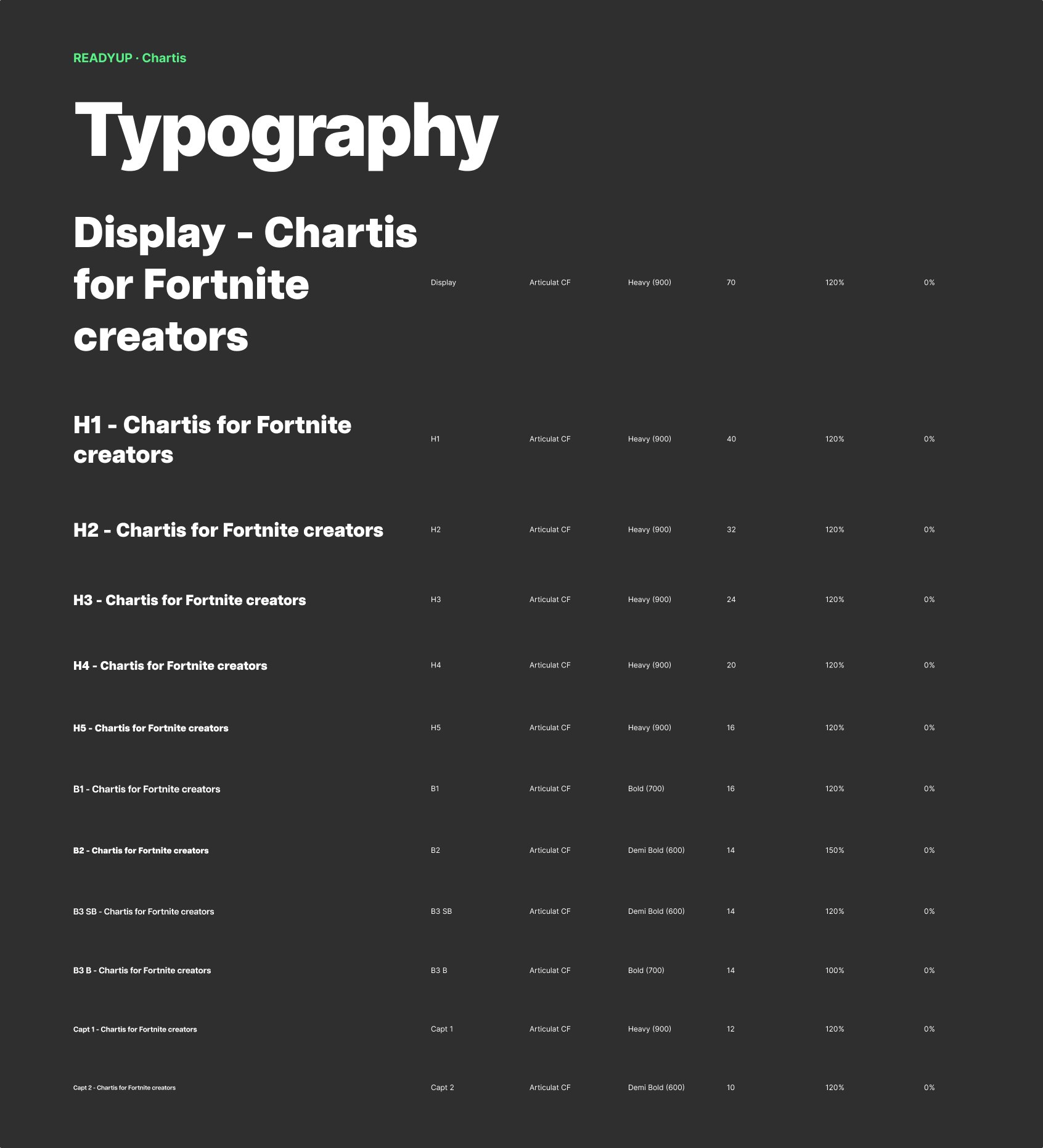
Redesigning ReadyUp’s existing dark-mode design system and designing a consistent light-mode theme that align with the platform’s new visual direction.
Support the ongoing development of the platform and improve new and existing screens that were already being built by the development team.
When I joined the project, the development team had already started transitioning the platform from dark mode to a new light version. Individual features were still being actively developed, but there was no complete system yet defining how the interface should look and behave within the new visual direction.
As a result, the product was functional, but visually inconsistent and required further UX/UI refinement. Different screens used different solutions, the hierarchy was not always clear, and new components were not yet based on one shared set of rules.
Another challenge was the existing design system. It had been created primarily for a dark interface and relied heavily on bright green as the primary color and yellow as an accent. The same colors did not translate well to light surfaces: their visual hierarchy, contrast and relationship with other interface elements changed significantly.
The development team had already started adapting the palette toward a solution that would work better in light mode and could potentially support a future dark version as well. However, the product still needed a consistent token structure, clear color roles and a complete system for component states.
New screens were being developed while the product was still transitioning, without a complete set of shared rules.
The previous palette and some components had been designed primarily for dark mode.
Brand, action, status and focus colors needed to be reorganized.
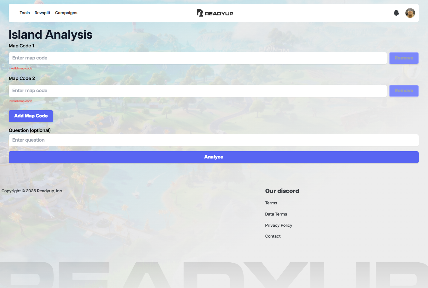
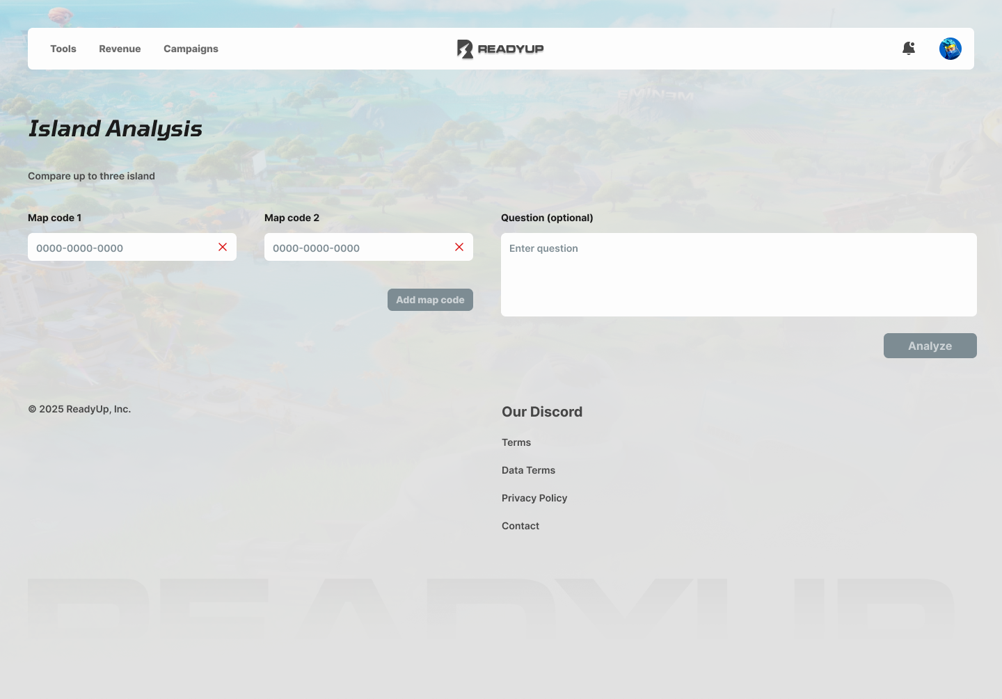
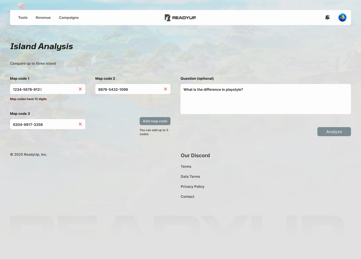
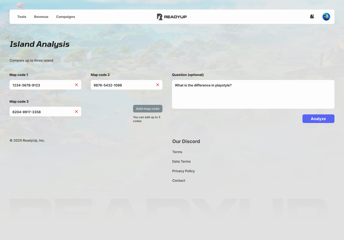
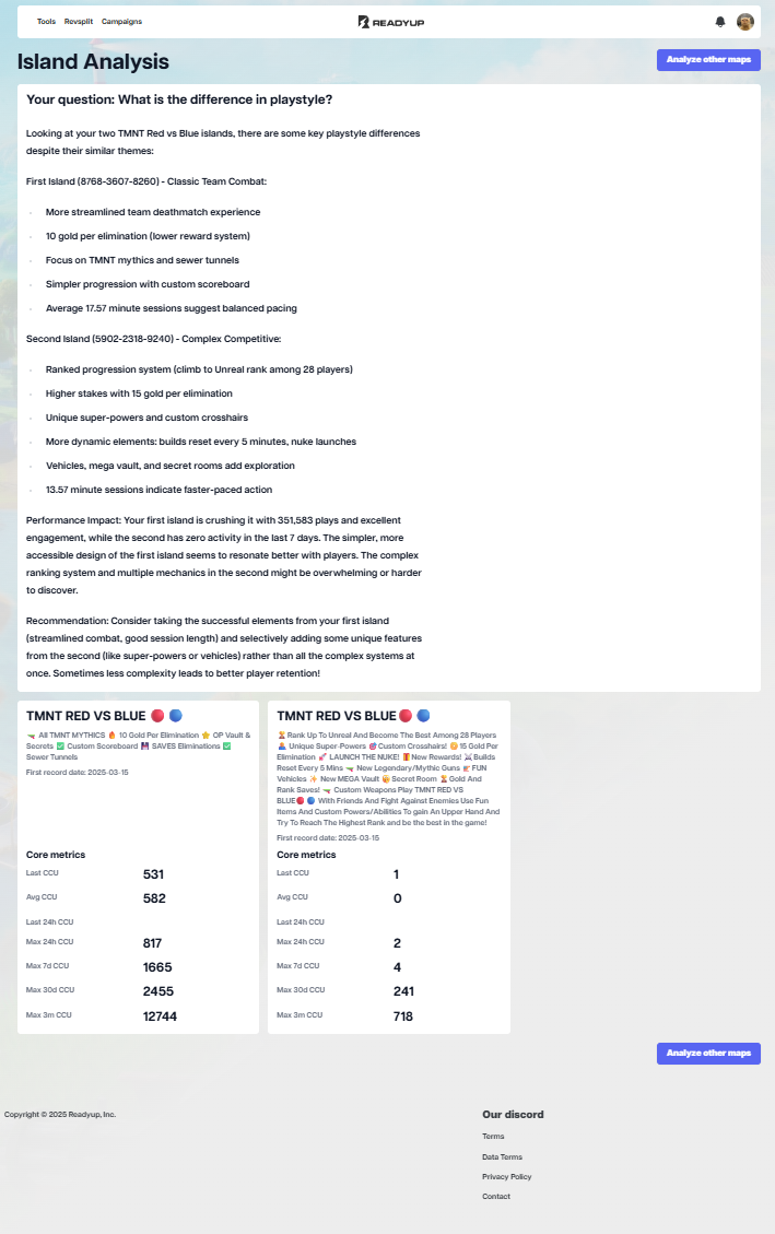
For example, in Island Analysis, adding map codes, entering an optional question and triggering the analysis were presented as one long form.
Elements occupied large areas of the screen without clearly communicating which information and actions were most important.
Forms, AI responses and analytical data did not yet form clear functional sections.
Some interface behaviors were designed locally instead of following shared system rules.
The interface needed to support different numbers of maps, questions, responses and comparison data without losing clarity.
An additional challenge was the lack of familiarity with the product specifics and platform features.
The product itself was also challenging because of its very specific features. Before joining the project, I had no experience with the process of creating Fortnite maps or with tools built specifically for their creators.
Before making design decisions, I first had to understand the creators’ workflow, the role of map codes, analytical metrics and the logic behind comparing individual islands.
This was especially important because in such a specialized product, a visually correct interface is not enough, its structure also needs to reflect the user’s actual workflow.
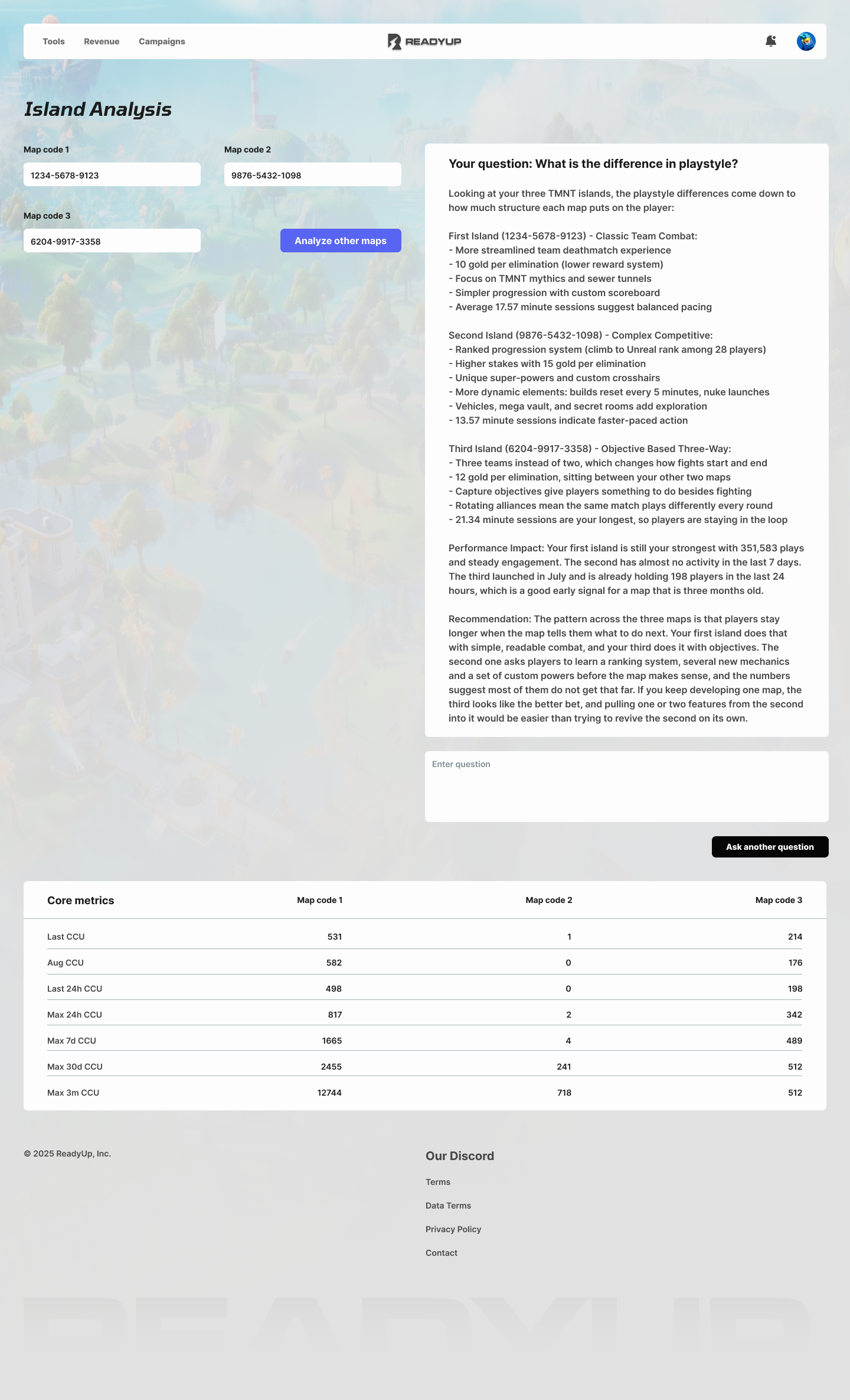

This figure was reported by the client's product managerand relates to the island analysis feature. I did not have access to the support data, so I cannot state the measurement window or the baseline.