Case study

Visual identity, website design, and implementation: Digital transformation of a local tire service in Ruda Śląska
About
A workshop serving hundreds of customers annually had no website: all communication relied on phone calls and a Google Business profile.
‍
The project was created for a local tire service workshop operating as a sole proprietorship in Ruda Śląska, Poland.
‍
Business overview:
5 years
of experience
+1000 clients
per year
+25 services
performed
I was responsible for the full UX/UI process and implementation in Webflow - from research and concept to final product.
‍
Scope: UX Design, UI Design, Web Design,  No-code

Year: 2026
Final version of the product: Link
Visual identity and promotional materials: Link
Primary goal
Create a measurable contact channel where none existed. Target: 15–25% of visitors initiate contact (phone tap or form submission) within the first three months.
Secondary goal
Reduce repetitive phone questions about pricing, services and opening hours by making this information easy to find.
Baseline
None. Before launch the workshop had no website and no analytics. All targets were therefore set as absolute values agreed with the client, not as growth against past performance.
Outcome
51% of visitors contacted the workshop within the first three months, against a 15–25% target. Full results and what I got wrong are at the end of this case study.
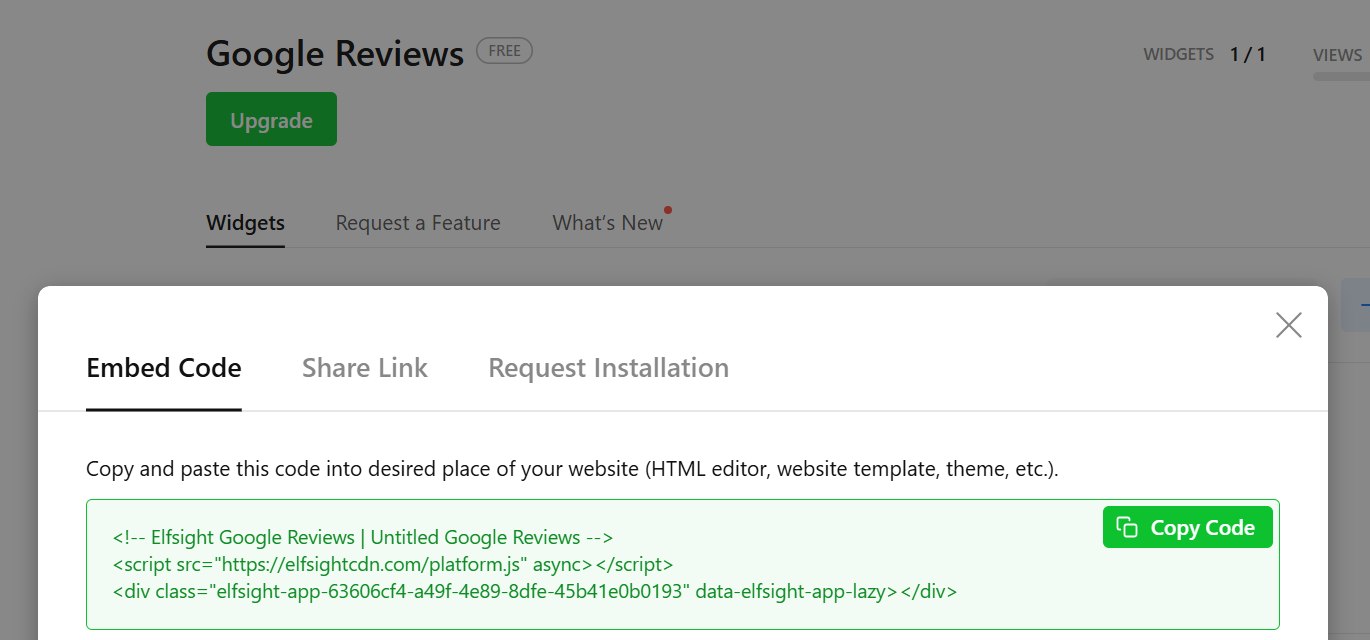
code to connect to google reviews to paste into webflowinformation about the inability to paste the code into webflow in the free plan
Challenges
How might we create a simple website that encourages users to contact the workshop while reducing basic information inquiries - while keeping maintenance completely cost-free?

Designing the first website for the workshop required translating an offline, trust-based experience into a clear and intuitive digital journey.
‍
The key challenges included:

- Limited budget and technical constraints - the solution had to be built within Webflow’s free plan, restricting available features and integrations.
- Designing for users with low digital literacy - the interface needed to be simple, clear, and highly intuitive.
- Challenging client communication - the owner runs a sole proprietorship, which significantly limited availability and required a very well-organized design process.
- No automated review integration - due to platform limitations, it was not possible to import Google reviews, despite their importance in building trust.
Process
Due to budget constraints, lack of prior online presence, and limited client availability, I chose a simplified, iterative approach focused on quickly gathering insights and validating key assumptions early on.
Instead of a traditional linear process, I focused on three key areas:

1.
Understanding context and users
 Competitor analysis, Google reviews, and client input helped identify common user needs and pain points.

2.
Prioritizing structure and content
 Rather than adding complex features, the focus was on simplifying information architecture and ensuring quick access to key content (services, contact, pricing).

3.
Iterative design and fast decision-making
 The project evolved in short cycles, with frequent client feedback and adjustments based on Webflow constraints. This approach minimized the risk of exceeding budget and ensured the solution matched real business needs.
Risks
Limited user data
Risk of incorrect assumptions
Low client availability
Risk of decision delays
Webflow limitations
Risk of functional compromises
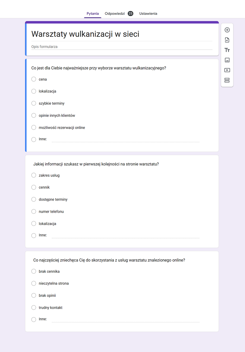
Questionnaire with questions for the study
blurred test results
About a research phase
The goal of the research was to understand what information and signals users need to feel confident contacting the workshop, and how a simple website can support that decision.

The research approach was designed to be fast and pragmatic, adapted to limited budget, client availability, and lack of existing data. It focused on identifying information gaps, trust-building elements, and barriers to contacting the workshop.
Competitive analysis
The analysis focused on tire service workshops operating in Ruda Śląska and the surrounding areas. Early in the research process, it became clear that only a small number of businesses had professional websites, which significantly limited the pool of competitors for comparison.

Due to the difficulty in finding a sufficient number of tire service websites, the scope of the analysis was expanded to include workshops offering additional services such as car mechanics and other related specialties.

Ultimately, I selected three direct competitors and two workshops with a broader service offering. I reviewed the information architecture and available functionalities of each website. To better synthesize the findings, only three key competitors are presented in the case study.

Insights:

- Competitor websites often made contact details easy to find and used strong CTAs, but they were sometimes visually inconsistent or poorly structured. Therefore, the new design should prioritize a clear, prominent contact section supported by strong visual hierarchy.
- Some competitors presented a wide range of services and detailed descriptions, but the content was overloaded and difficult to scan. Therefore, the website should focus on simplified service presentation and scannable content structure.
- Some competitors offered advanced features like booking or online store, but core information was still hard to understand. Therefore, the focus shifted from adding features to improving clarity and accessibility of key information.
Strengths:
Online booking available
Clear menu structure and service offerings
Multiple contact options
Weaknesses:
Outdated design
Hardly visible CTA
Insufficient visual hierarchy of content
Strengths:
Very strong CTA
Contact details easy to find
Integrated online store
Weaknesses:
The page was probably made from a template (the same as wymianaopon.vip)
Chaos in the text section
Overloaded navigation menu
Strengths:
Strong visual identification and modern layout
Visible shopping cart and shopping CTA
Clear presentation of the product offer
Weaknesses:
Information overload in service cards
There is no clear visual hierarchy in the hero section
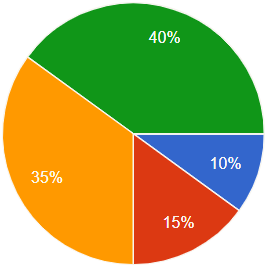
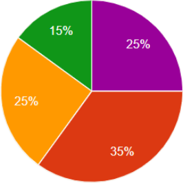
What is most important to you when choosing a tire service shop?
a graph showing the results of the study
price
location
quick appointments
reviews from other customers
online booking available
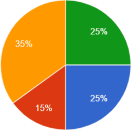
What information do you look for first on a tire service website?
a graph showing the results of the study
scope of services
price list
available dates
phone number
location
What most often discourages you from using a tire service shop you found online?
a graph showing the results of the study
no price list
unreadable website
no reviews
difficult contact
Initial research
At the early stage of the project, I conducted a brief exploratory research with people who regularly use tire service workshops. The goal was to understand their needs, expectations, and decision -making process when choosing a service provider. The research took the form of a short online survey and served as a foundation for further design decisions.

I collected respondents' answers using Google Forms, asking them 3 simple questions. I posted the form on a popular Facebook group related to automotive topics. 20 people participated in the study.

Insights:

- Research showed that reviews are the most important factor for 40% of users, and their absence discourages 35% of respondents. Therefore, the design must prioritize a dedicated testimonials section - even in a static form due to platform limits - to build immediate credibility.
- A significant 35% of users look for a price list first, and 25% are discouraged by its absence. Therefore, the website should include a clear and accessible pricing overview to meet user expectations and reduce bounce rates caused by information gaps.
- Users highly value quick appointments (35%) and look for available dates (25%) on the website. Therefore, the Hero Section and primary messaging should emphasize "no queues" and provide a fast, direct way to check availability via a prominent CTA.
Proto-personas
I created two proto-personas to empathize with the users of my website and to better understand their needs, goals, and frustrations. They serve as a foundation for making informed, user-centered design decisions. The personas were created based on data provided by the workshop, representing the company’s average user.

The personas were created based on a questionnaire completed by the client, as well as customer reviews from Google Maps. The questionnaire focused on key aspects such as customer problems, frustrations, frequently asked questions during phone calls, and their overall feedback about the service. This approach helped identify common patterns in customer needs and behavior.

Insights:

- Research showed that users like Anna feel overwhelmed by industry-specific language and complicated forms. Therefore, the website should be written in plain, accessible language with a "one-click" contact method, while technical details should be relegated to a dedicated section on the service page.
- For users like Michał, who value their time and need to compare offers quickly without making phone calls, transparency is key. Therefore, the design should prioritize a clear information architecture that allows users to verify the scope of services and pricing in a matter of seconds.
- Both personas expressed a lack of trust in websites that look chaotic, outdated, or overloaded with pop-ups. Therefore, the new design should focus on a professional, clean visual hierarchy and modern aesthetics to reflect the workshop's reliability.
About
Age: 32
Vocational education
Ruda Śląska, Poland
Single mother of two
Shop assistant
5000 zł per month
Basic tech literacy
„I don’t know much about cars, so when choosing a workshop, I rely on other people’s opinions.”
Goals
Easy access to the offer on the website and to user reviews
Make sure she chooses the most affordable reasonable option that fits her household budget
Frustrations
Feels overwhelmed when a website uses industry-specific language
Does not trust websites that look complicated or chaotic
Is irritated by the need to create an account or fill out long forms
Short BIO
Anna is 32 years old and works as a shop assistant. She mainly uses the Internet on her smartphone at a basic level. When choosing services she doesn’t know much about, she relies on recommendations and other people’s opinions. She values simple, clear websites, preferably with user reviews.
About
Age: 48
Master’s Degree
Katowice, Poland
Married, one child
Office worker
8000 zł per month
Intermediate tech proficiency
Short BIO
On a daily basis, he balances computer-based work with family life, which is why he greatly values his time and convenient solutions. He looks for simple, clear information: what, for how much, and how fast. He likes to feel in control of his spending and hates price surprises.
“If I can’t see a price list or a clear offer, I look for another option. They must be trying to rip me off!”
Goals
Quickly find pricing information
Verify whether the workshop provides the required service
Compare offers across workshops without making phone calls
Frustrations
Having to search the website to find pricing information
Dislikes websites overloaded with banners and pop-ups
Does not trust websites that lack up-to-date information or look outdated
Key factors influencing contact decision
(multiple answers allowed)
Reviews
Pricing
Quick appointment
Availability
40%
35%
35%
30%
Based on primary research conducted for this project
Summary
After the analysis, I identified five main conclusions based on the research:

- Research and personas highlight that users rely on opinions, and their absence is a major deterrent. Therefore, the design must prioritize a dedicated, prominent testimonials section to build immediate credibility and address the trust gap.
- Users often feel overwhelmed by technical jargon and chaotic layouts found on competitor sites. Therefore, the website should use plain, accessible language and a scannable content structure.
- A significant number of users look for pricing first and are discouraged when it is missing. Therefore, the new design should feature a clear, easy-to-find pricing overview and a simplified presentation of the workshop’s service scope.
- Users express a lack of trust in outdated or cluttered websites with poor structure. Therefore, the design should focus on a modern, professional visual hierarchy and clean aesthetics to reflect the workshop's reliability and quality of service.
- Both research and persona goals emphasize the need for quick appointments and "no-queue" service. Therefore, the Hero Section should instantly communicate the "no-queue" value proposition and provide a "one-click" contact method to ensure a fast, direct user journey.
Design approach
Design phase focused on translating research insights into a simple, trust-focused website structure. Key decisions were validated through internal feedback and aligned with user needs identified during research.
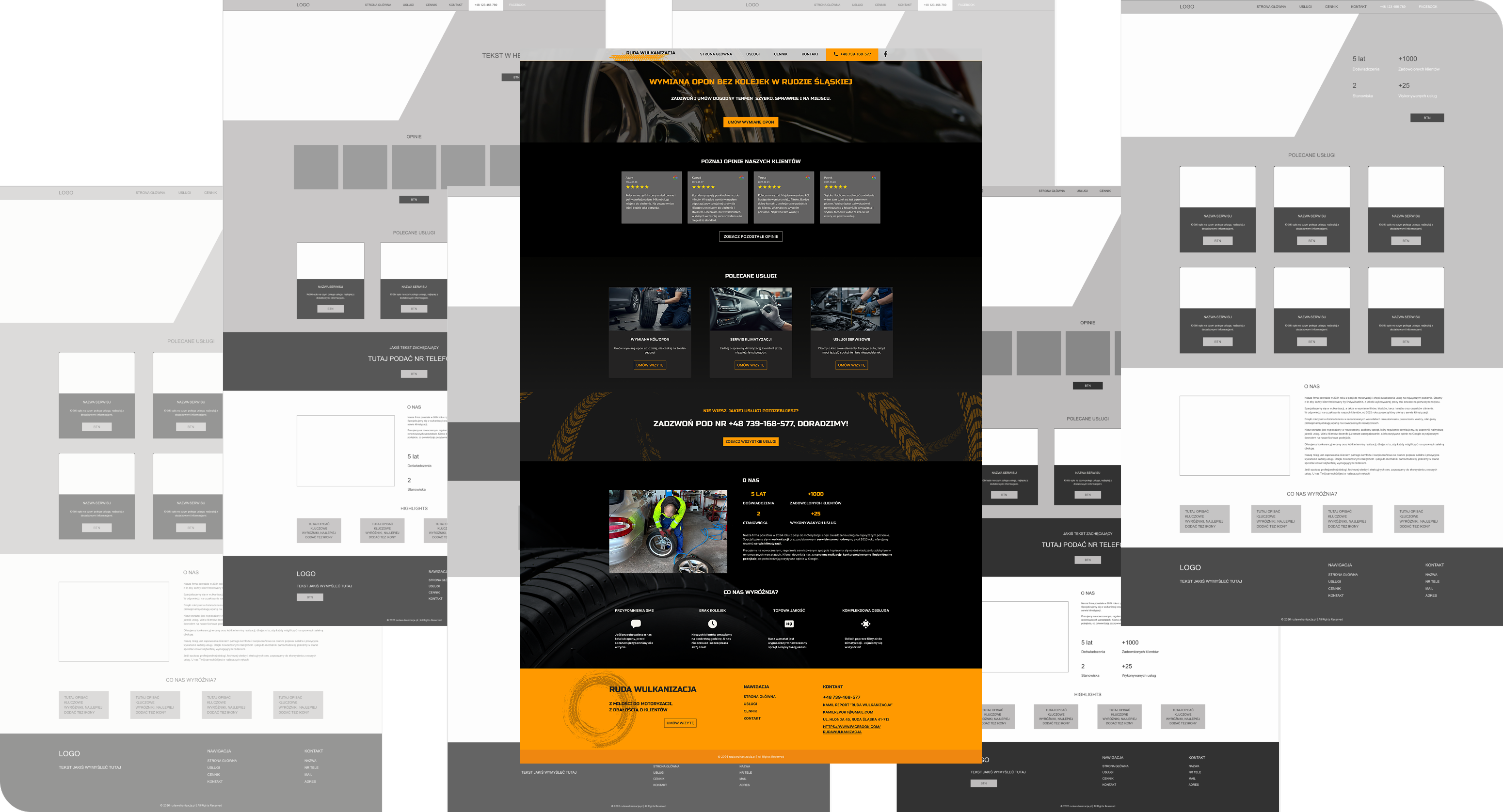
Low-fidelity wireframes for the homepage, services and contact pages
Exploration
To identify the most effective layout, multiple approaches to hierarchy, CTA placement, and service presentation were explored.
Design decisions
Design decisions were based on research insights and both user and business goals. Multiple options were explored, and final choices prioritized clarity, simplicity, and project constraints.
Insight
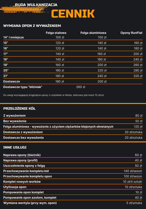
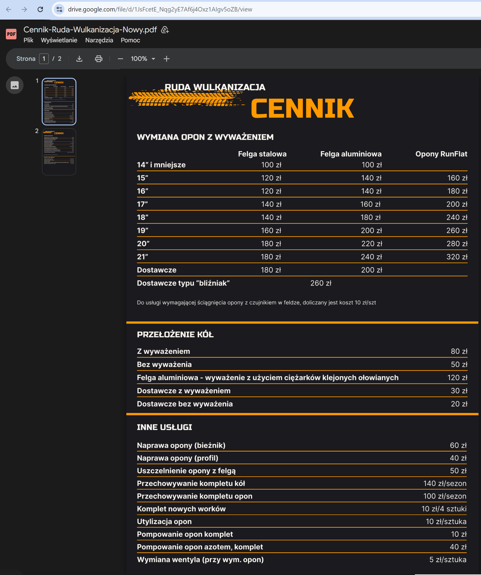
Research showed that pricing is one of the first elements users look for, and its absence reduces trust and slows decision-making.
Decision
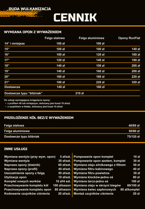
A simplified pricing overview was displayed on the website, with a full price list provided as a PDF hosted on Google Docs for easy updates.
Reason
This solution provides quick access to key information while allowing the client to update prices without development work or maintenance costs.
Insight
Both research findings and persona goals emphasized the need for quick appointments and “no-queue” service. Users prioritized speed, availability, and immediate contact over general credibility metrics.
Decision
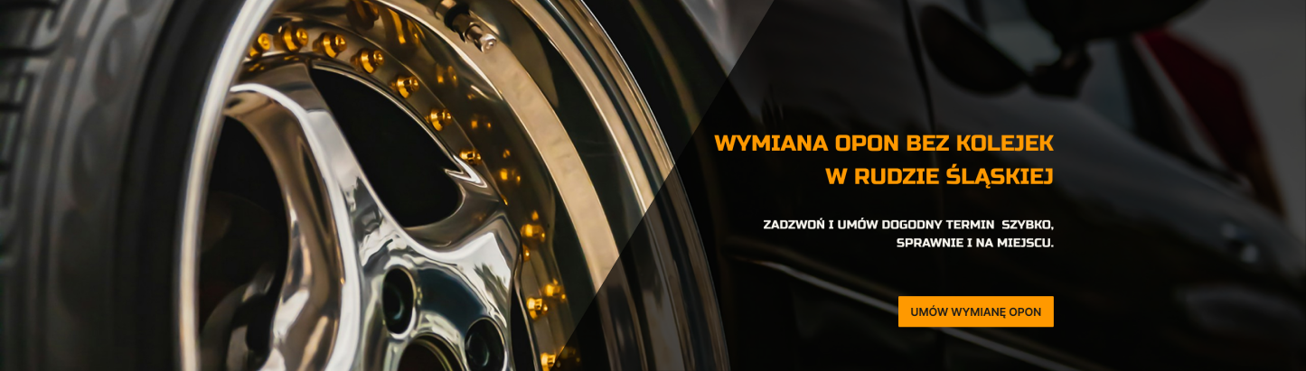
The Hero Section focuses on a clear “no-queue” value proposition: “Tire change without queues in Ruda Śląska”, supported by a short action-oriented description and a primary CTA: “Book tire change”. Experience metrics were removed to reduce visual noise and prioritize immediate action.
Reason
This approach communicates the main user benefit instantly, reduces decision friction, and encourages fast contact. It aligns with user expectations for quick service and creates a direct, one-step path to booking.
Insight
Research showed that users need simple, easy-to-understand service descriptions and quick decision-supporting information. Technical terminology and lack of context (e.g. when the service is needed) made choosing a service more difficult, especially for users with low automotive knowledge.
Decision
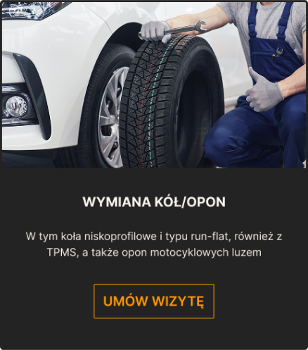
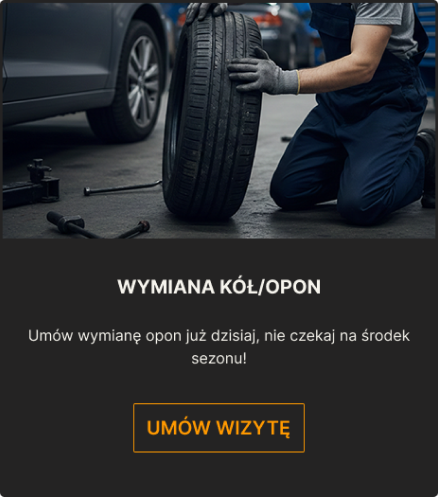
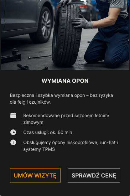
The card based solely on technical description was rejected. Two card types were introduced: a simplified featured card used on the homepage with a short value-focused message and CTA, and a more detailed service card containing additional information such as service duration, recommended timing, and a section with technical details.
Reason
This approach keeps the homepage simple and scannable while providing more detailed information at the service level. Users can quickly decide, while those needing more technical details still have access without increasing cognitive load.
A message from a satisfied customer
Decision validation
Design decisions were driven by research insights and UX principles. Multiple options were explored, and the final solutions were selected based on clarity, usability, and project constraints. The chosen direction was then presented to the client and approved before implementation.
Constraint-driven design
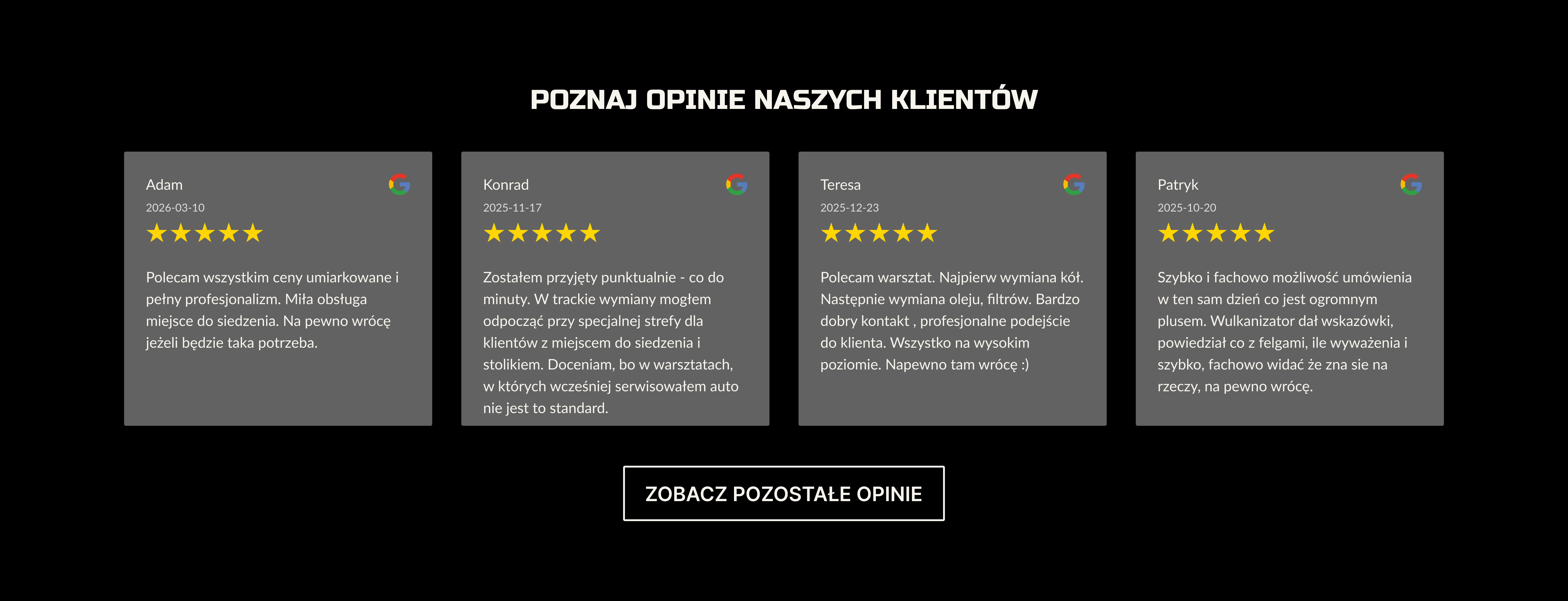
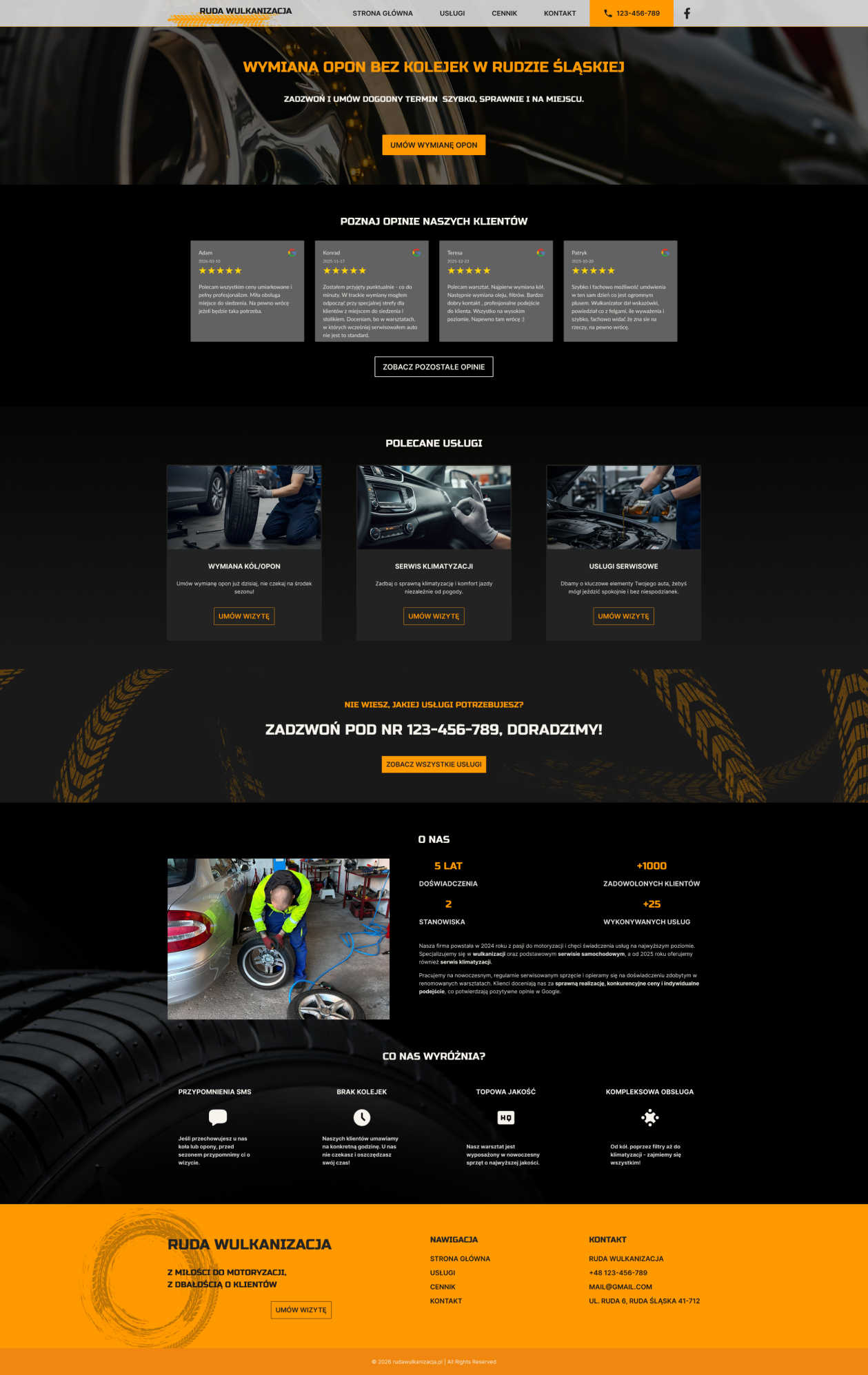
Due to Webflow free plan limitations, customer reviews could not be dynamically imported from Google. Instead, a static testimonials section was designed to preserve credibility while keeping the solution completely cost-free. The reviews displayed on the website were selected from real customer feedback published on the Google Business profile. To maintain transparency and provide access to full social proof, a secondary CTA labeled “See all reviews” was added, linking directly to the Google listing with all user reviews.
Customer reviews on desktop view
The success metrics listed below were measured using Google Analytics 4 (GA4).
Contact interaction rate
50.85%
Target 15–25% (exceeded).
‍
Users who tapped the phone number or submitted the contact form.
Key information engagement
16.95%
Target 40% (not met).
‍
Users who opened the pricing, services or reviews section.
Engagement quality
67.8%
Target above 60% (met).
‍
GA4 sessions longer than 60 seconds, or with at least two page views.
Source: Google Analytics 4. Period: 1 February – 30 April 2026. Sample: 118 users.This is a small sample, typical for a local service business. The numbers show direction, not statistical significance.
Summary & Lessons learned
The primary goal was met. In the first three months after launch, 50.85% of visitors tapped the
phone number or submitted the contact form, against a target of 15–25%. The engagement rate
reached 67.8%, against a target above 60%.Engagement with the pricing, services and reviews sections fell short of the target: 16.95%
against 40%. The contact rate indicates that the landing experience establishes sufficient trust
right away. Users feel confident enough to initiate direct contact immediately, skipping deeper
section exploration and clarifying details during the call or message instead.Delivering the project required working within several constraints: a website that had to be
maintained completely free of charge in Webflow, a tight schedule and rapid implementation.
Google reviews could not be imported automatically, so I selected real ones from the Google
Business profile and linked out to the full listing. If long-term costs prevent automation, a
well-planned manual workaround can be just as effective.Limited stakeholder availability required an asynchronous and highly structured approval process,
with clearly scoped decision points — an approach I now use by default.

Project scope
The final design prioritizes clarity, trust, and fast contact, supporting increased inquiries and reducing basic information questions.
Final homepage design, desktop and mobile viewFinal homepage design, desktop and mobile view
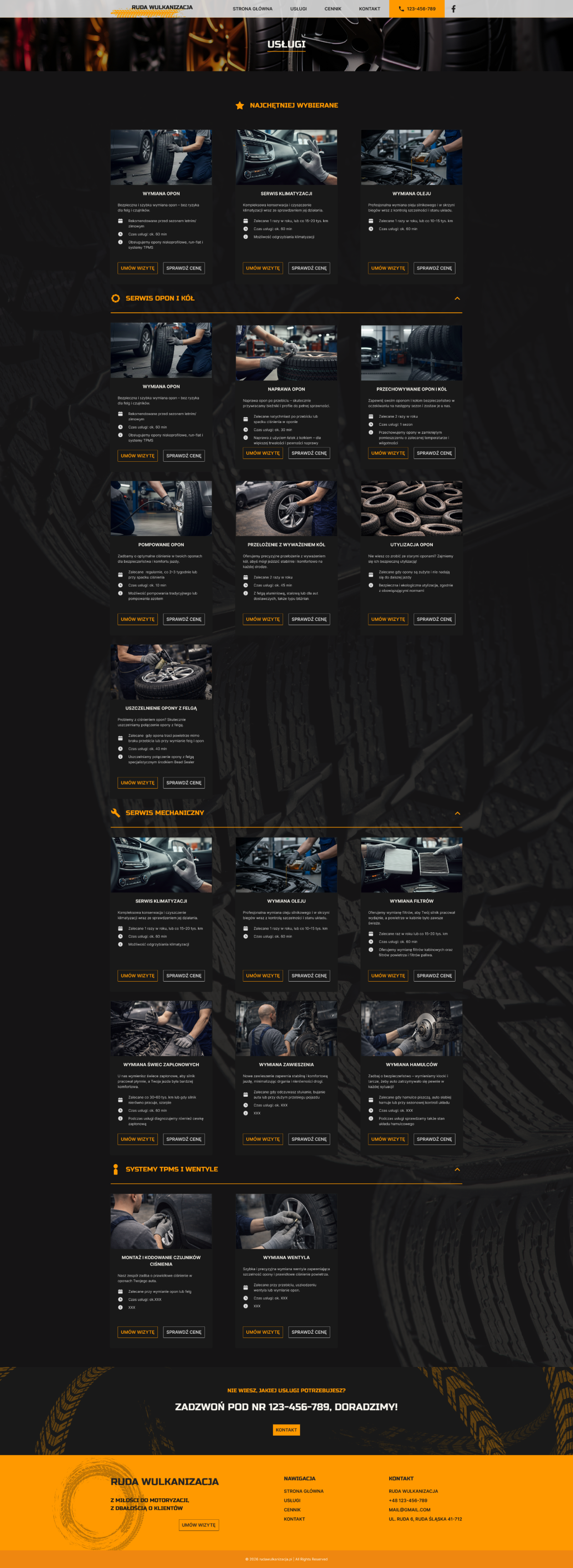
Final services design, desktop and mobile viewFinal services design, desktop and mobile view
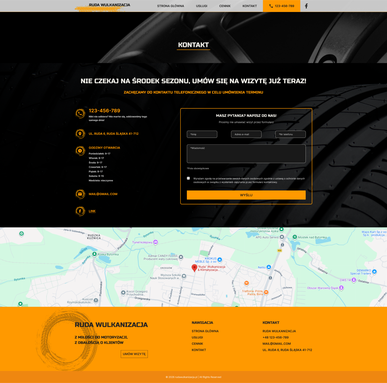
Final contact design, desktop and mobile viewFinal contact design, desktop and mobile view