Case study
Information architecture and WCAG 2.1 for a home builder's website (redesign)
About
Trudzia builds turnkey houses in Wrocław and the surrounding region. The company had a website, but it worked like a printed brochure: nine services hidden inside one dropdown, long unbroken text on every service page, and no page at all for building permits — the service the marketing team was about to spend its campaign budget on.

The marketing team arrived with a 24‑page brief: screenshots of the live site annotated with what to move, remove and expose. I redesigned 16 desktop views on top of it: a rebuilt navigation, a new building‑permit landing page, and two priced house pages restructured so the price and its scope sit in the first screen. In four places, following the brief literally would have made a page slower or harder to use. I proposed a different solution each time and agreed it with the client before it went into the file.

Business overview:
20 years
on the market
250+
houses built
+160
designs adapted
Figures published by the client on their own website.
I was responsible for the whole UX/UI process: auditing the existing site, rebuilding its information architecture, designing every view, and preparing the design system and the handoff for an external development studio.

Scope: UX Audit, Information Architecture, UI Design, Web Design, Design System, Accessibility (WCAG 2.1), Developer Handoff

Delivered: 16 desktop views, a mobile homepage, and a component library.

Year: 2025

Status: Designed, not implemented
Final version of the project:
Link
Primary goal
Give the company's paid campaigns a page that can convert. Build a dedicated building‑permit landing page, the service Trudzia sells hardest and had no page for and put a quote request one step away from anywhere on the site.
Secondary goal
Make the offer understandable without a phone call. Put the price, the price per m², the floor area and what the price covers in the first screen of both house pages, and give the service pages a structure people can scan instead of a wall of text.
Baseline & status
None. The site had no goal tracking, and the redesign was never implemented. The client had budgeted separately for the design and for the build; when the development studio quoted the implementation, the figure came in far above what they had expected, and they decided the investment was not worth it. So this case study has no results, only decisions and the reasoning behind them. Had it shipped, I would have tracked three things: quote‑form submissions and phone taps per session, the contact rate for campaign traffic landing on the building‑permit page, and how far people scroll on the two priced house pages.
In the brief
In the final project
Status
In the brief
A wide top bar with contact details and links to social profiles
In the final project
Built as briefed: phone, e-mail, Facebook, Instagram, YouTube.
AS BRIEFED
In the brief
A complete rebuild of the main navigation
In the final project
Seven top-level items instead of the eleven labels in the brief's mock-up; three of those labels moved into a bar below the hero.
DEVIATION 1
In the brief
A bar at the bottom of the hero for moving further down the page
In the final project
One element answers both requests: jump links to Comprehensive approach, Guide and Reviews.
AS BRIEFED
In the brief
“Our comprehensiveness” — nine specialist roles, each with a 40–60 word description
In the final project
Nine icons with one-line labels; the headline from the brief moved down to the section under the hero.
DEVIATION 2
In the brief
Replacing the hero's background photo with video
In the final project
Dropped after I argued against it: load time, the cost of producing the footage and a higher build cost. The hero stayed static.
DEVIATION 3
In the brief
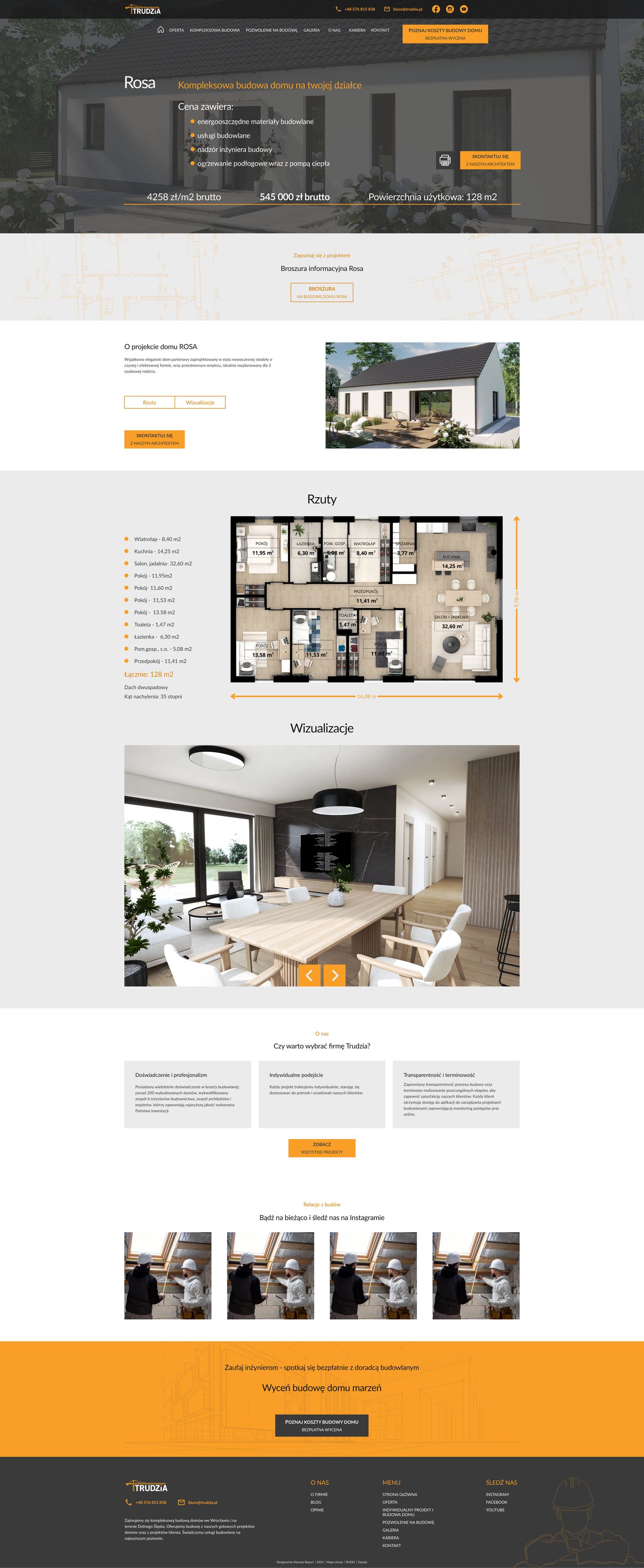
Rosa and Mgiełka: expose the price, floor plan before the visualisations
In the final project
Price, price per m², floor area and scope in one band inside the hero; image order reversed; the layout built as a reusable template.
DEVIATION 4
In the brief
“Comprehensive construction” takes over the content of “Offer”, minus adaptations and catalogue designs
In the final project
Built as briefed: adaptations and catalogue designs became separate pages.
AS BRIEFED
In the brief
A new “Building permit” page for campaigns — very clear, with a fast way to make contact
In the final project
Built as briefed: a six-step process bar, seven service blocks and a CTA to the architect.
AS BRIEFED
In the brief
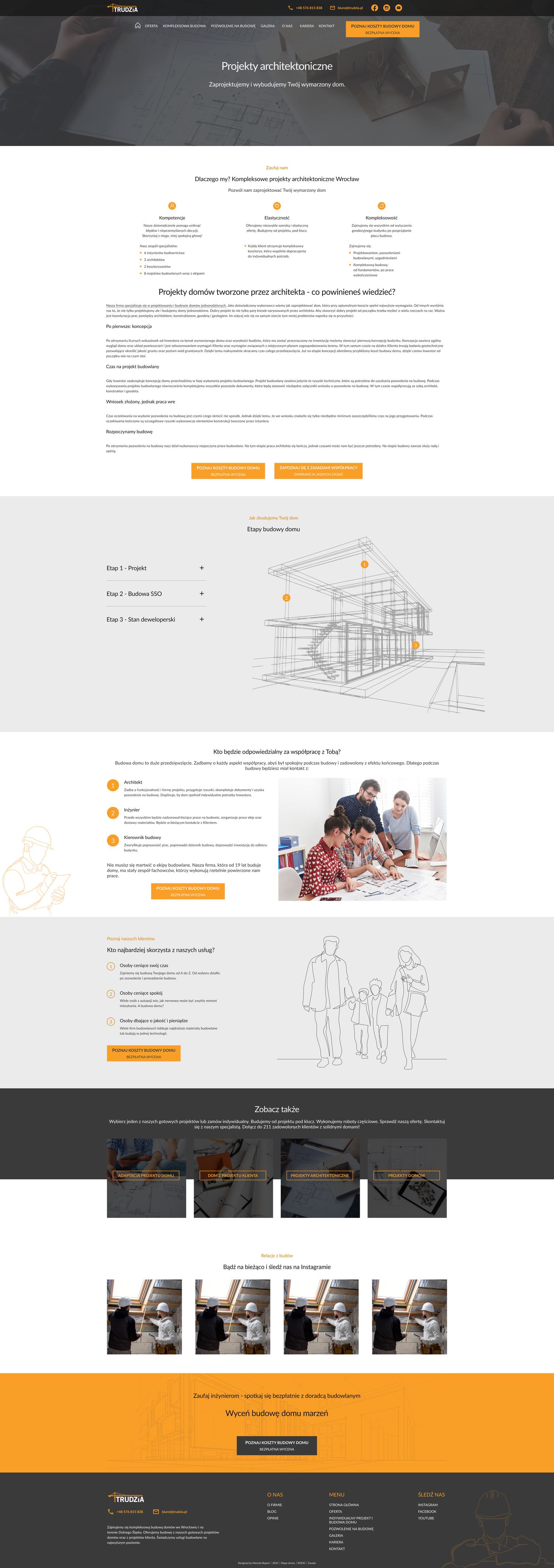
Adaptations: clarity and simple graphics
In the final project
The eleven process steps as a sequence with icons, with the long text moved below them.
AS BRIEFED
The brief
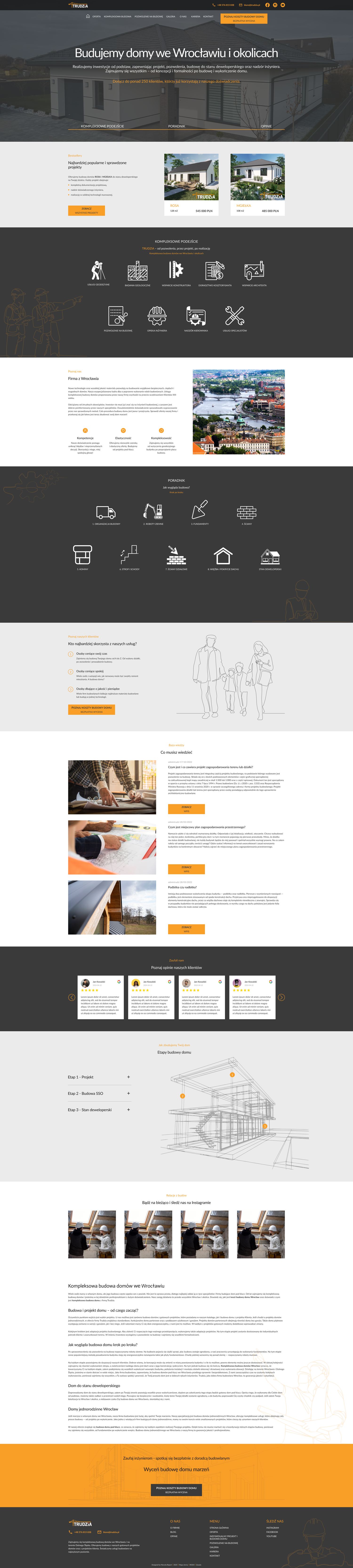
The brief came from Trudzia's marketing department: 24 pages of brief with screenshots of the live site, each one annotated with what to move, remove or bring forward. They wrote it because, in their own words, the site had got old. It still worked, but the offer it presented was no longer the offer the company was selling. Nine services sat in a single dropdown with equal weight, and the two things the business wanted to lead with  comprehensive turnkey construction, and its own house designs sold at a fixed price were buried somewhere inside it. The service the marketing team was about to run paid campaigns for, obtaining a building permit, had no page at all: one sentence inside another page was the whole of it, so paid traffic had nowhere to land. Underneath the layout instructions, then, the brief had a single goal: make the site sell what the company sells now, and give the campaigns somewhere to point. That last page was the only one in the project I designed from nothing.
Design decisions
The brief prescribed layouts, not problems. Before designing anything I wrote down the goal behind each instruction and in most places the instruction and the goal pointed the same way, so I built exactly what had been asked for. In four places they did not. Each card below shows what the brief asked for, what I designed instead, and the reason. All four were discussed and agreed with the client before they went into the file.
Navigation: two services promoted, not eleven labels added
Insight
The old menu had six top‑level items and hid nine services inside one “Offer” dropdown, including the two the company runs paid campaigns for. The brief solved this by putting eleven labels in the bar.
Decision
I kept seven top‑level items and promoted only “Comprehensive construction” and “Building permit” out of the dropdown. The three remaining labels from the brief: Comprehensive approach, Guide and Reviews, became a jump bar at the bottom of the hero.
Reason
Those three labels are sections of the homepage, not destinations, so they belong to the page rather than to the site. The same bar also answers a second request from the brief a way to move down from the hero.
Comprehensiveness: nine icons instead of nine paragraphs
Insight
The brief asked for the company's nine specialist roles, each with a 40–60 word description, and for the line “Trudzia from permit, through design, to construction” as the hero headline.
Decision
I kept the line but moved it one section down, directly under the hero, and replaced the nine descriptions with nine icons and one‑line labels.
Reason
Nine text blocks need roughly three screens to say one thing: we handle all of it. As a single icon row it takes one screen, and the promise still lands as the first thing after the hero, which is what the client actually cared about. The full descriptions stayed where someone reads them on purpose: on the service pages.
Hero: a photograph instead of video
Insight
The brief proposed replacing the hero's background photograph with video. The homepage's job, by the client's own definition, is to get a visitor to a quote request and campaign traffic arrives there on mobile connections.
Decision
I argued against it and we kept a static photograph, with the headline, a one‑line description of what the company delivers, a social‑proof line and a jump bar over it.
Reason
A video background would have added load time to the one page that has to work fastest. This was the first thing I pushed back on, and it set the tone for the rest of the project.
House pages: the decision block moves into the hero
Insight
Rosa and Mgiełka are the company's own designs sold at a fixed price the only part of the offer a visitor can compare with a competitor without calling. On the old page the price, the floor area and what the price covers sat in separate blocks, and interior visualisations came before the floor plan.
Decision
I put the price, the price per m², the floor area, what the price includes and the primary CTA into one band inside the hero image, and reordered the page so the floor plan comes before the visualisations. Rosa was designed as the template for Mgiełka and for the flagship designs the client planned to add later.
Reason
Someone comparing three houses needs the number, the size and what the number buys in a single look. The floor plan answers “does this house fit us”; the visualisations answer “do we like it” and that is the second question, not the first. Building it as one template meant every future house page would inherit the same decision instead of being redesigned.
How might we
How might we turn a brochure‑style website into a sales channel for paid campaigns using the client's existing content, brand and photography, and working from a brief that already prescribed the solution?
The brief
24 pages of annotated screenshots with layout instructions. It described solutions, not problems.
So I read the goal behind each instruction before drawing anything.
01
The content
Long SEO text the client would not shorten. A business requirement, not an oversight.
So structure had to do the work that cutting would normally do.
02
The evidence
No research phase, and no analytics running on the live site.
So every decision holds up against the brief, the content and practice and says so.
03
The handover
An external studio would build it, on a separate contract, and I never spoke to them.
So components, states and spacing had to be buildable from the file alone.
04
Challenges
How might we turn a brochure‑style website into a sales channel for paid campaigns using the client's existing content, brand and photography, and working from a brief that already prescribed the solution? A brief written as a solution, not a problem. The marketing team delivered 24 pages of annotated screenshots with layout instructions. My job was to find the goal behind each instruction and decide which ones to follow literally. Content the client would not shorten. The long SEO text was a business requirement. No research phase and no analytics. The client arrived with a finished brief, and the live site measured nothing. Every decision had to hold up against the brief, the existing content and standard practice, not against data I did not have. Implementation by a studio I never spoke to. The build was a separate contract with a separate budget, so the design had to be documented well enough for another team to price it and build it from the file alone.
Process
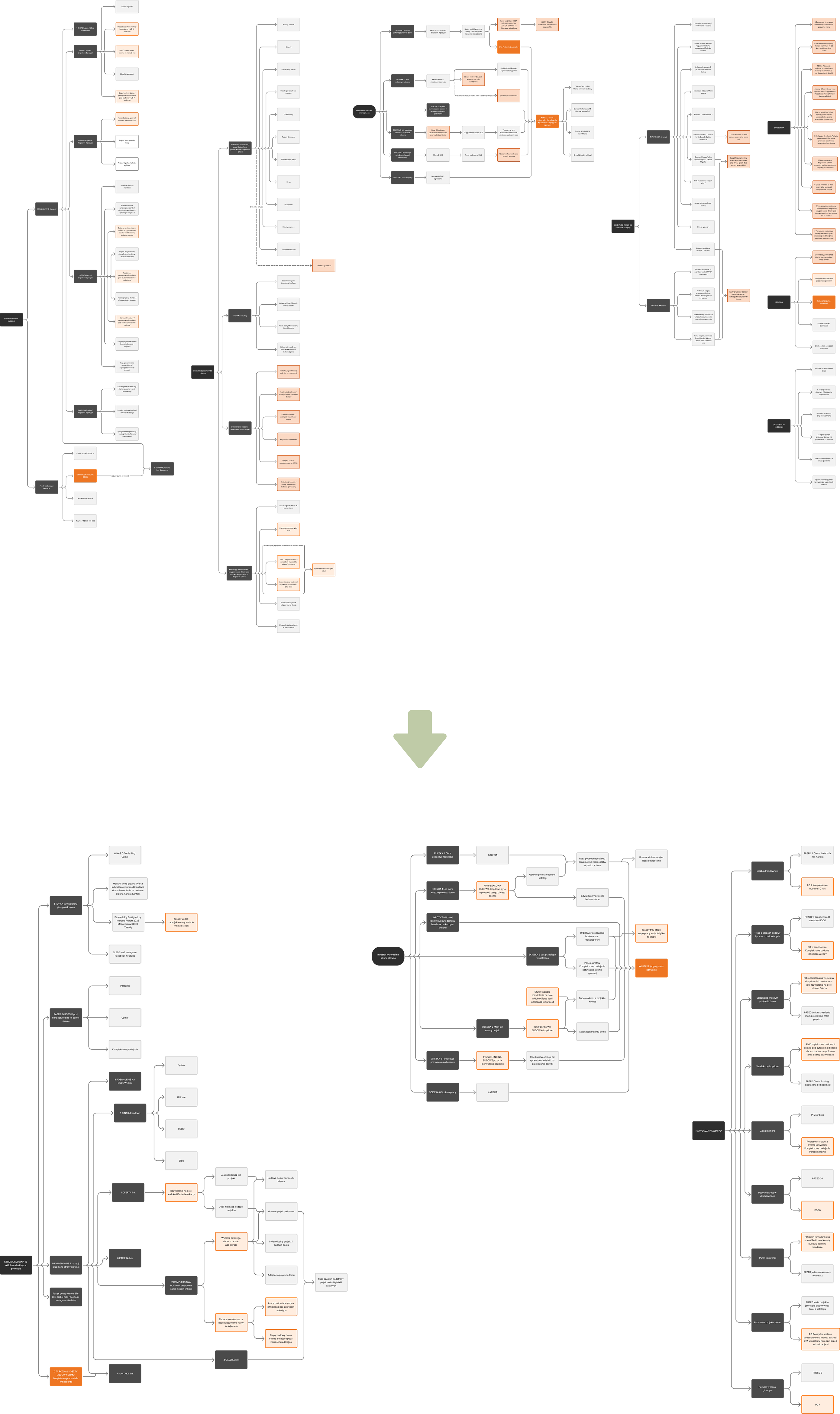
There was no research phase. The client arrived with a finished brief and a clear idea of what they wanted, so I built the project on the two sources I actually had  the brief and the site itself and worked through them in four passes. 1. Reading the brief for goals. I went through the brief page by page and wrote down the goal behind each instruction, not the instruction itself. For example: “Rebuild the navigation bar” is a solution; “people cannot find the two services we sell hardest” is the problem underneath it. 2. Auditing the live site, page by page. I checked the existing site against WCAG 2.1: contrast, focus states, heading hierarchy, alternative text and keyboard operation  and mapped its structure at the same time: where each service actually lived, which page led to which, how many clicks separated a visitor from each service, and where the content stopped being scannable. 3. The two lists side by side. On most points the brief and the audit pointed the same way, so I designed exactly what had been asked for. On four they pulled in different directions, those became the design decisions above. 4. Rebuilding the information architecture. The audit had given me the map, so the last pass was tightening it. I rewrote the main menu and lifted the two commercial services out of a nine-item dropdown to the top level. The building-permit service got a page of its own. Adaptations and catalogue designs were split out of “Offer” into separate pages. And “Terms of cooperation” came off the main bar and moved to where someone actually needs it  at the end of the building-permit page, where the next question is what working together looks like.
“A wide top bar with contact details and links to our social profiles.”
Contact should never be more than a glance away this business closes on the phone.
“A complete rebuild of the main navigation bar.”
People cannot find the two services we sell hardest.
“A bar at the bottom of the hero for moving further down the page.”
Visitors stop at the first screen and never see the rest.
“‘Our comprehensiveness": nine specialist roles, each with a 40–60 word description.”
Show that we handle the whole build, not part of it.
“Replacing the hero's background photo with video.”
The homepage should feel current the site looks its age.
Accessibility
The WCAG 2.1 audit of the trudzia.pl homepage covered 50 criteria at levels A and AA. The site fails to meet 16 of them.

Three issues are critical:
1. The brand’s orange color has a contrast ratio of 2.11:1 (against a required 4.5:1).
2. The hero slider is not keyboard-accessible.
3. Missing alternative text for images and certain page elements.

Eight of the 16 unmet criteria are determined at the design stage, so I addressed them in my design.

For light backgrounds, I added a darker orange shade that achieves a 5.02:1 contrast ratio against white, and I applied a fixed overlay to darken images containing text. The remaining criteria depend on implementation, specifically keyboard handling and the site's code, so I could only document them for the developers.
Five areas for improvement
Colour and contrast:  the palette gained a second, darker orange for light backgrounds (5.02:1 on white), and the original stayed where it already works: on the dark graphite, where it reaches 8.57:1. Every photograph carrying text got a fixed darkening layer, so readability no longer depends on which image loads  on one of the three hero photographs, more than half the sampled points fell below the threshold. Focus:  a visible focus style defined for every interactive component in the library, and closed states specified as hidden rather than moved off screen, so the tab order matches what is on the screen. On the live site, 41 of 143 tab stops land on something the visitor cannot see. Heading structure:  one H1 per page and a heading order that follows the visual one. The small labels above each section heading are labels, not headings; on the live site nine of them are marked up as H3 and sit above the H2 they introduce. Alternative text:  the handoff marks which images carry meaning and which are decorative, and every icon-only control has a name written for it. On the live site, decorative images carry file names as their alternative text, and four visible controls have no name at all. Keyboard operation:  the slider, the dropdown navigation and the quote form specified as keyboard-operable, in an order that matches the layout. On the live site the hero slider cannot be operated by keyboard at all: two of its three slides are unreachable without a mouse. Of the sixteen criteria the live site does not meet, eight are settled in the design: colour, type, heading structure, form labels and link styling. Three are specified in the design but only exist once someone builds them: keyboard operation of the slider, focus order, closing a menu with Escape. Five can only be fixed in code: a skip link pointing at an anchor that does not exist, duplicate IDs, a missing language attribute, and accessible names in the markup. Those five went into the developer documentation. The redesign was never built, so none of this has been re-measured on a live site. What this section shows is a starting point and the decisions taken against it.
16 / 50
Criteria not met
10 at level A, 6 at level AA.
2.11:1
Brand orange contrast
On white, and as a button fill. 4.5:1 required.
45 / 152
Text below threshold
Sampled across the page, including text over photographs.
41 / 143
Tab stops off screen
Mostly a closed menu moved sideways instead of hidden.
Information architecture
Nine services sat in one dropdown in the order they had been added, and two more dropdowns held things that are not navigation at all, a privacy page filed next to a guide on building stages. I mapped the whole site before redrawing anything: every page, where it could be reached from, and how many steps separated a visitor from each service. The largest dropdown became a question. Nine services in a flat list became four, opened by one line: “Choose where you want to start.” The four are not service names but the four situations a visitor can be in: I have my own design, I need one designed, I need mine adapted, or I want one of yours. Same offer, sorted by the visitor's problem instead of by the order the services were added. Two services moved up to the top level. Comprehensive construction and Building permit are what the company sells hardest and where its paid campaigns point. Both were inside the nine-item list, and the building permit had no page of its own at all. It got one, and both got a place in the main bar. The guides left “About us”. Building stages and Construction works are the two pages someone reads while deciding and they were filed under “About us”, next to the privacy policy. They moved into the Comprehensive construction dropdown as a two-card knowledge base, under a second line: “See also our knowledge base.” Three labels left the menu entirely. Comprehensive approach, Guide and Reviews are sections of the homepage, not destinations. They became a jump bar under the hero which also answers the brief's second request, a way to move down from the first screen.
Second entrance
A menu only helps someone who opens it. So the same fork appears a second time, in the page itself: at the bottom of the Offer page, two cards ask “If you already have a design” and “If you don't have a design yet”. Someone who scrolled instead of using the menu meets the same question, in the same words, and lands on the same pages. That is the part of this work I would repeat on any site with more than a handful of services. The menu sorts the offer; the page has to sort it again for the person who never looked at the menu.
6 → 7
Top-level items
One more label, two more services visible.
4 → 2
Dropdowns
Galeria and Kariera stopped needing one.
9 → 4
Largest dropdown
A flat service list became four starting points.
20 → 10
Items inside dropdowns
Half as much hidden behind a hover.
The building-permit page
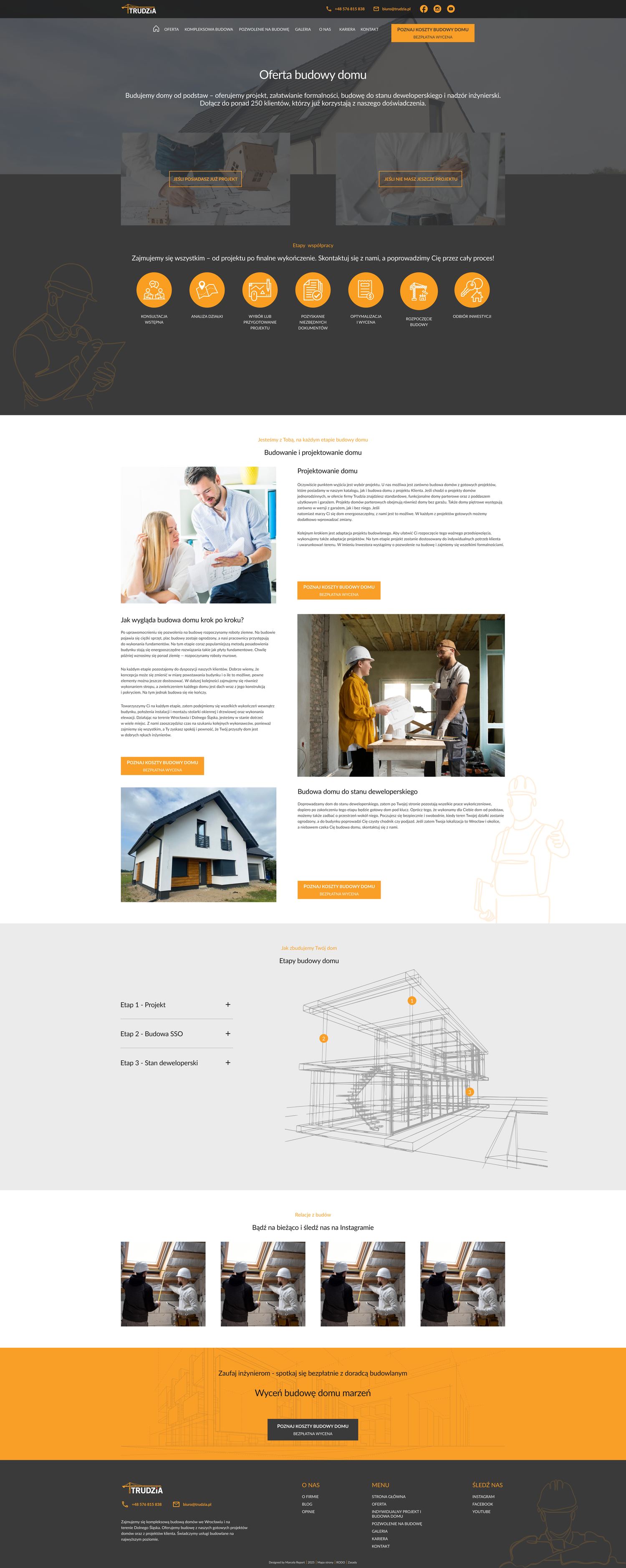
This is the only page in the project that did not replace anything. Trudzia's marketing team was about to put campaign budget behind one service obtaining a building permit on the investor's behalf. On the live site that service was a single sentence inside the Offer page. Paid traffic would have landed somewhere that was about something else, and the brief said so plainly: a new page, reachable from the homepage, very clear, with a fast way to make contact. Someone arriving from an ad has one question: will you do this for me, and what does it involve? The page answers it at three depths. Six icons across the top give the whole process in a five‑second scan, from checking the plot to handing over the complete documentation. Seven blocks underneath say what each step actually means and, just as importantly, what the investor does not have to do. A contact CTA sits at both depths: “Talk to our architect” in the hero, and a link to the terms of cooperation immediately after the process row, because the question after “can you do this” is “on what terms”. The page then closes with the same blocks that close every other subpage: who the service is for, recent updates from the sites, and the quote CTA.
Design system
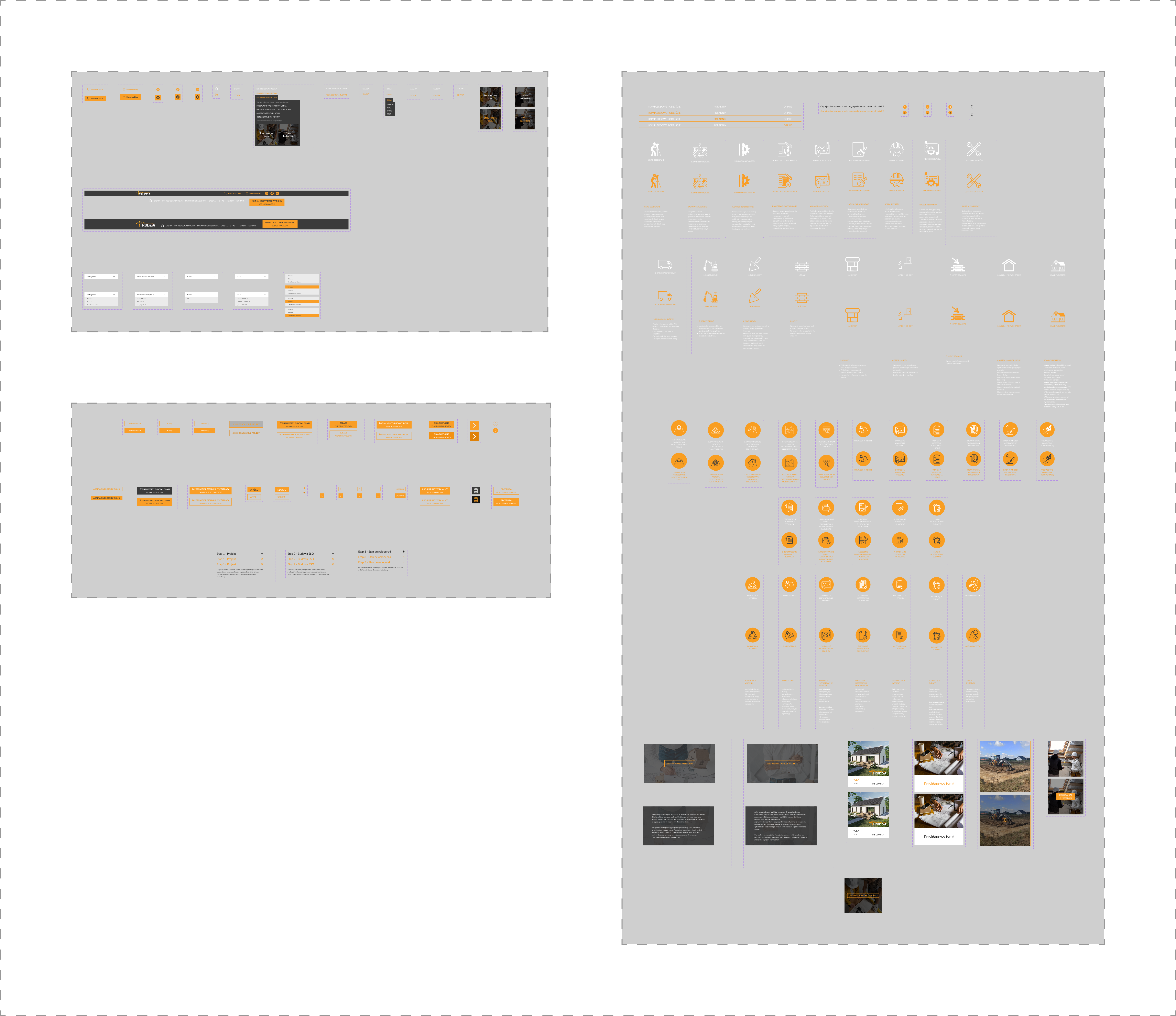
I designed a component library for this project from scratch. However, for some components I used licensed icons purchased specifically for the project. Every repeating element across the sixteen desktop views is an instance of something defined once. 27 content components: drop-down menu, project cards, list rows, process steps, the testimonial block, the knowledge-base tiles. 19 button variants, each drawn in different states. 4 drop-down menu types, including a select with a closed state, an open state, and a highlight drawn for every option in the list. Header and footer as single components, placed as instances on all sixteen views, the header in two states, full and compact (visible when scrolling the page). A licensed icon and line-illustration set 41 elements, selected for this industry.
Design system & handoff
I was not going to build this site, so the file had to be readable by people I would never meet. Every repeating element was built as a component with its states defined, spacing was set with dedicated spacer components rather than by eye, and the icon set, licensed for this client, was applied consistently across every view. What that came to: 27 components, 19 button variants, four field types, a header and a footer, and a documented set of rules for the studio that would implement it.
Project scope
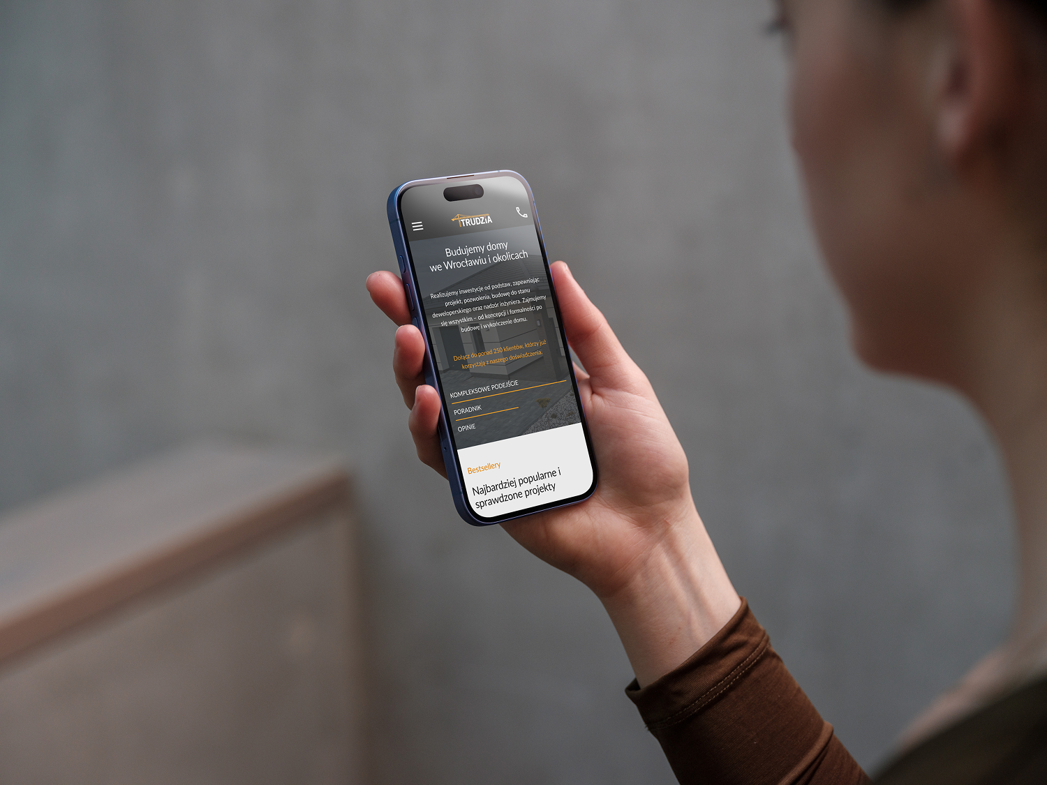
Sixteen desktop views and only the homepage at mobile. The desktop set covers the whole site, from the homepage and the two priced house pages to the legal pages. The design was approved and never built. The client had budgeted separately for the design and for the implementation. When the development studio quoted the build, the figure came in far above what they had expected, and they decided the investment was not worth it. The project stopped mid‑way: the desktop set was complete and the responsive work had reached the homepage. That is where the project ended, not where I chose to stop: the implementation quote arrived while the mobile views were still being drawn.
Lessons learned
A brief written as a page layout is still a brief about a problem. Behind every instruction on those 24 pages was a reason. Reading the reason instead of the instructions allowed me to turn three screens into one, skip a video no one needed, and still give the client what they asked for. I described components, states, and spacing for a company I'd never spoken to. I don't even know what their workflow was like. Thanks to this project, I realized how important it is to maintain contact with the implementation during the design phase.
Before → After
The old site was not broken. It had simply drifted away from the business behind it: services added one at a time over the years, each new page taking the shape of the one before it, and the offer the company leads with today sitting somewhere in the middle of a list. Most of what changed is structure rather than styling what appears first, what gets a page of its own, and how much someone has to read before they can act.
Home
Services
From your plans
Terms
Careers
House plans
Rosa
Custom design
Adaptation
About
Contact
The live Trudzia homepage before the redesign, full page
Redesigned Trudzia homepage, full page
older site
Redesign
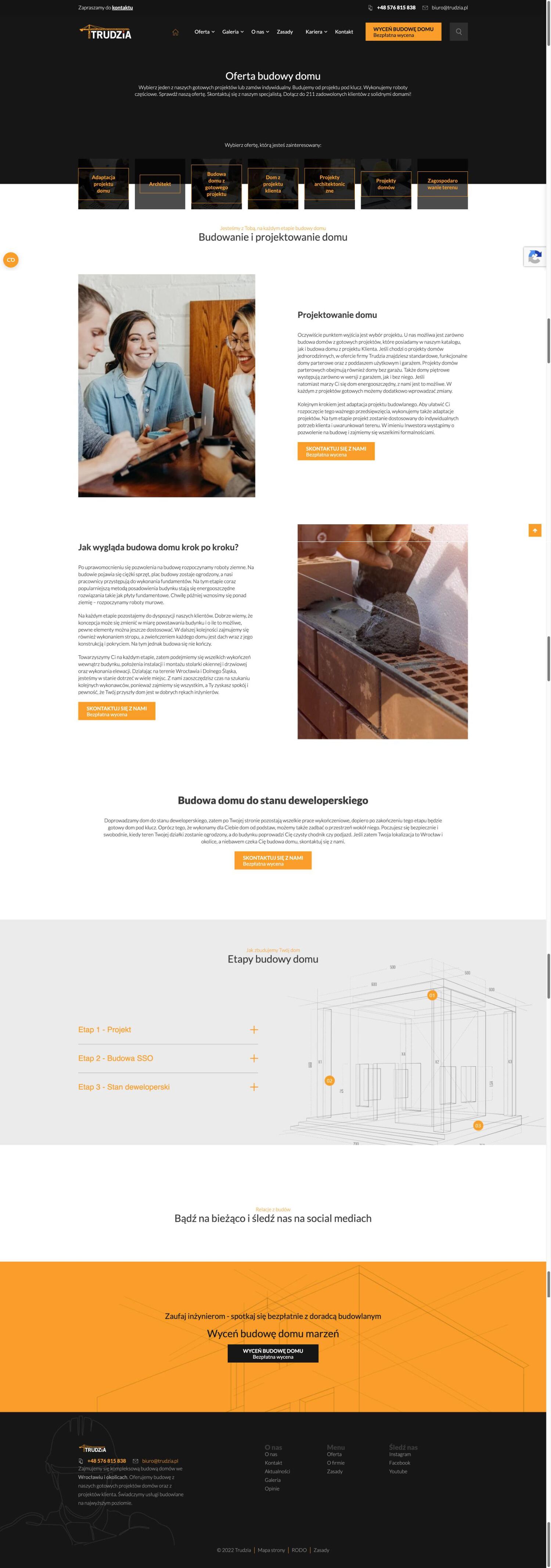
Trudzia Services page before the redesign, full page
Redesigned Trudzia Services page, full page
older site
Redesign
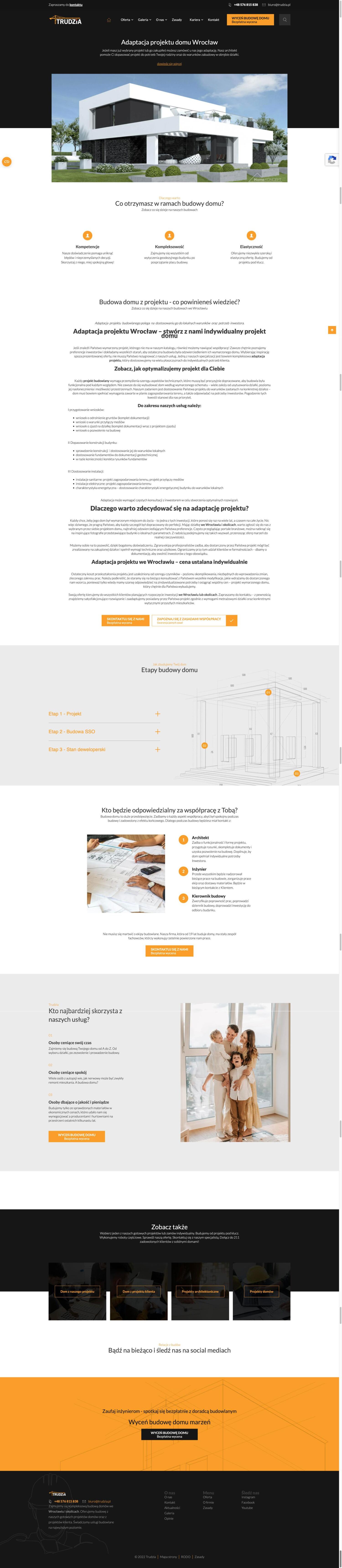
Trudzia page about building from the client's own plans before the redesign, full page
Redesigned Trudzia page about building from the client's own plans, full page
older site
Redesign
Trudzia Terms page before the redesign, full page
Redesigned Trudzia Terms page, full page
older site
Redesign
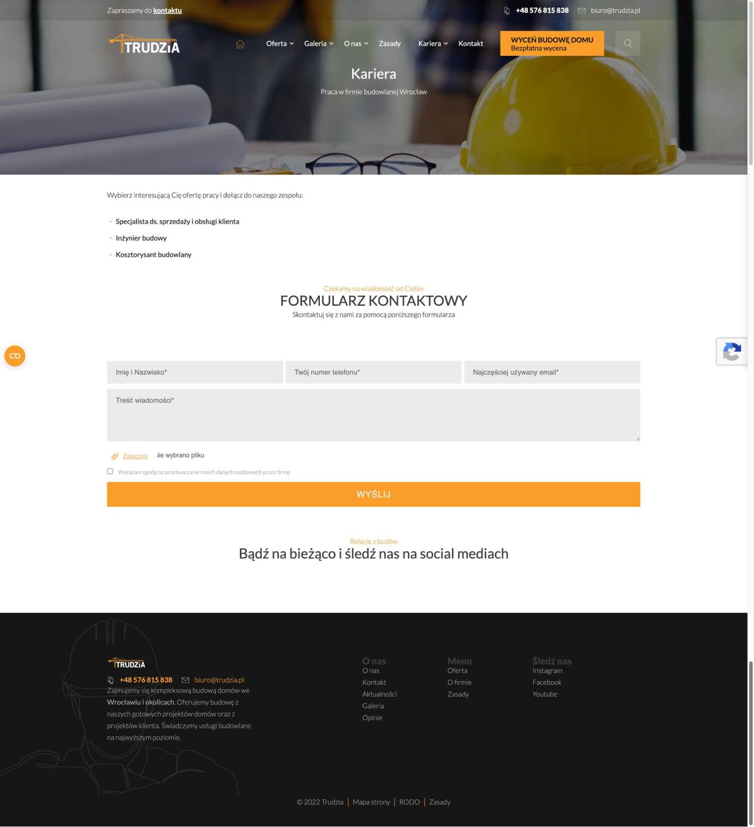
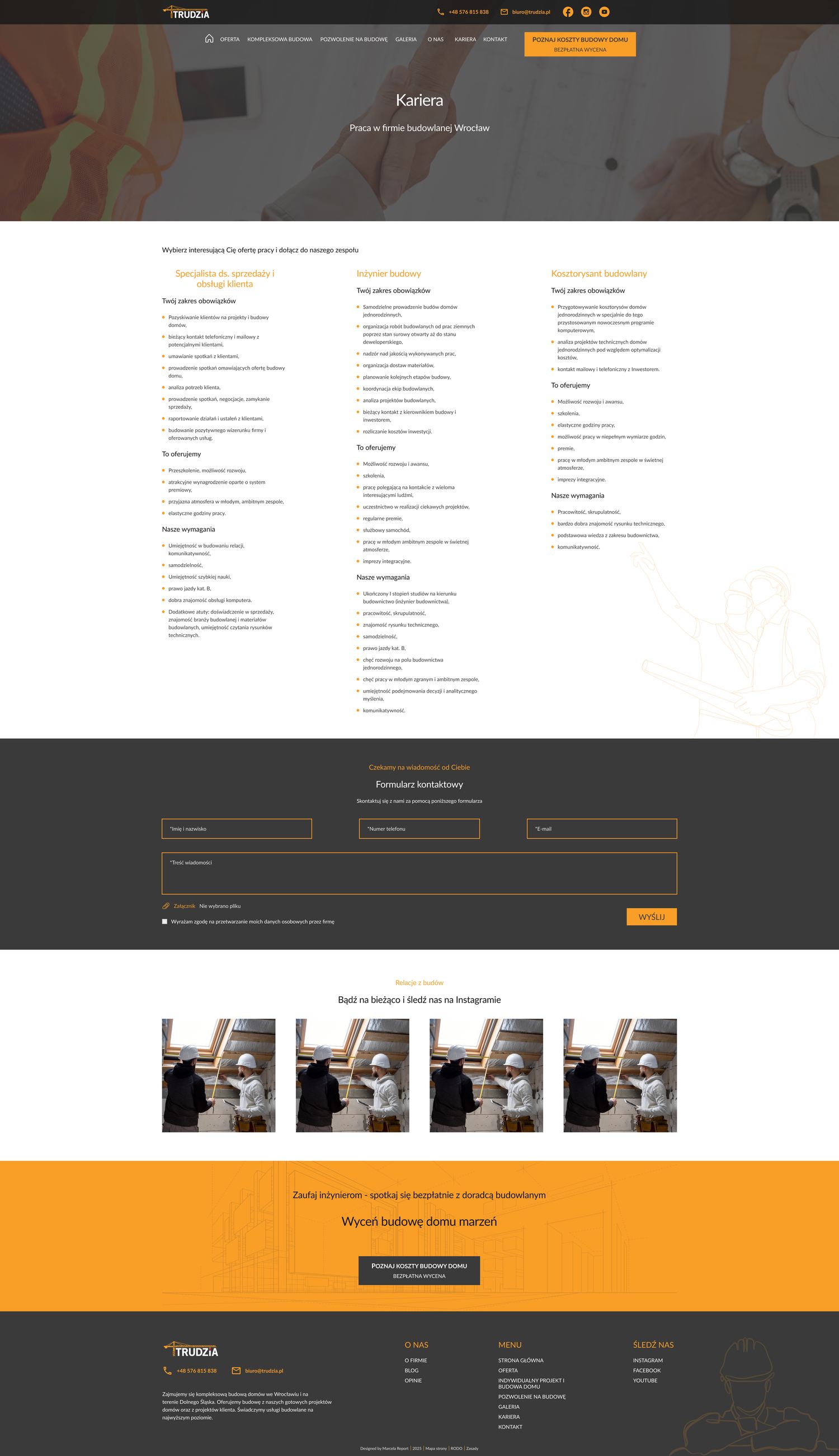
Trudzia Careers page before the redesign, full page
Redesigned Trudzia Careers page, full page
older site
Redesign
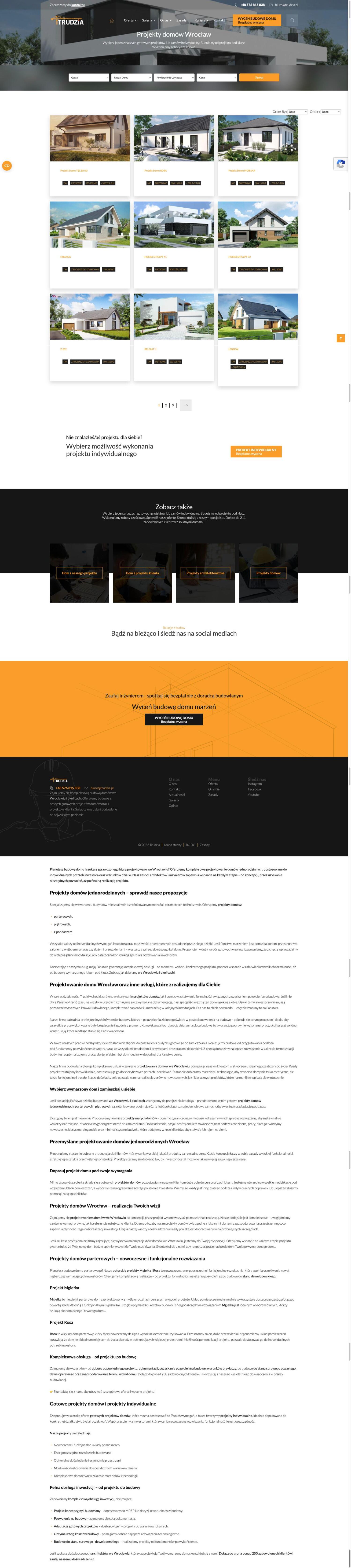
Trudzia house plans catalogue before the redesign, full page
Redesigned Trudzia house plans catalogue, full page
older site
Redesign
Trudzia Rosa house page before the redesign, full page
Redesigned Trudzia Rosa house page, full page
older site
Redesign
Trudzia custom design and build page before the redesign, full page
Redesigned Trudzia custom design and build page, full page
older site
Redesign
Trudzia design adaptation page before the redesign, full page
Redesigned Trudzia design adaptation page, full page
older site
Redesign
Trudzia About page before the redesign, full page
Redesigned Trudzia About page, full page
older site
Redesign
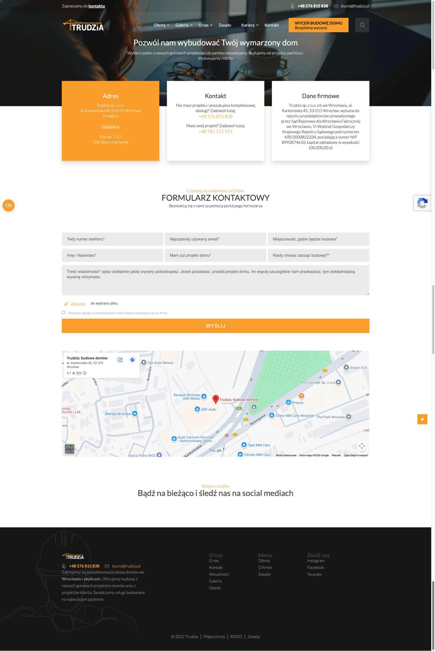
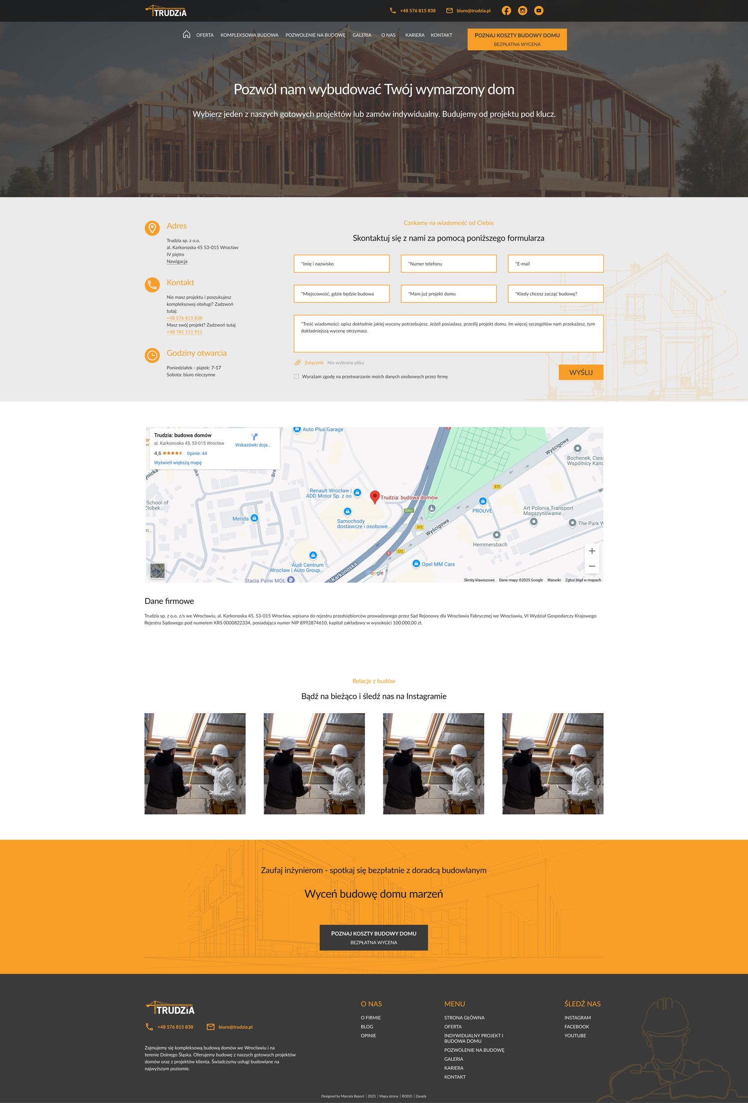
Trudzia Contact page before the redesign, full page
Redesigned Trudzia Contact page, full page
older site
Redesign